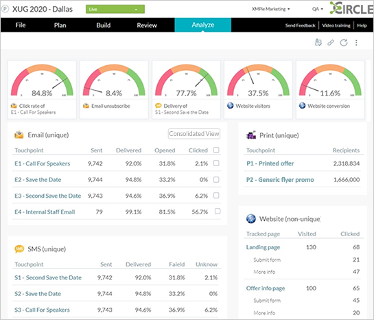
The Analyze dashboard provides a consolidated high-level view of the analytics of all touchpoints in the campaign.
From the Analyze dashboard you can drill in and access the detailed analytics of each touchpoint.
Viewing touchpoint analytics side-by-side enables you to analyze the performance of the entire campaign at a single glance.
Watch Analyze tab video
The top row of the Analyze dashboard shows up to five default KPI gauges, based on the content of the project.
Below the gauges are tables showing analytics for all touchpoint types (email, SMS, web, print) which exist within the campaign. You can drill in to the touchpoint to get more specific analytics for each touchpoint.
You may want to see the analytics of multiple email touchpoints consolidated into a single view. This is very useful when using manual A/B testing or manual throttling.
In order to see metrics of multiple touchpoints together, select the checkbox of the thouchpoints whose metrics you want to combine, and click the Consolidated View button.
The content of the dashboard is sensitive to the content of the actual project. In the above example, the project contains email, SMS, print and web touchpoints.
The Analyze tab appears only if the campaign is connected to uProduce.
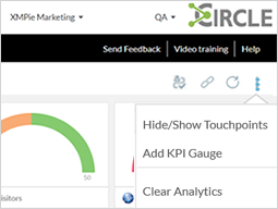
As the administrator or builder, you can customize the content of the dashboard by hiding touchpoints and adjusting the KPI gauges.
You can set up the dashboard in the template level so that all instances have the same custom dashboard.
Note: This option is available only for Administrators and Builders.
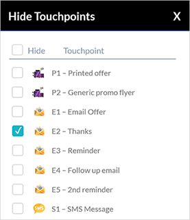
By default, all project touchpoints are listed in the tables.
You may have touchpoints in your project for which there is no need to show on the dashboard, or which you don't wish to show the person monitoring the campaign. You can hide these touchpoints.
To do so, click the menu button in the top right corner and select Hide/Show Touchpoints.
Select the touchpoints you wish to hide. You can display these touchpoints again at any later time.
Note: This option is available only for Administrators and Builders.
The Analyze dashboard comes with predefined KPI gauges, based on the touchpoints of the campaign. You can duplicate the KPIs, change their order and delete the unnecessary ones.
Before executing the campaign, you can add KPI gauges to the dashboard up to a maximum of 5, or replace the displayed ones and customize them as needed.
To customize a gauge, click the menu button below the gauge
and then click the edit ![]() button to open the gauge
customization dialog.
button to open the gauge
customization dialog.
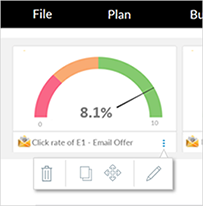
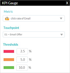
You can change the metric of the KPI gauge from the Metric dropdown list. This list shows only metrics available in your campaign.
For example, change the gauge metric from Click rate of email to Open rate of email. You will also have to specify the touchpoint for this metric. Note that the Email unsubscribe rate provides data from all email touchpoints.
The Website visitors gauge applies to visitors of all pages of the website.
In the Website conversion gauge you can include visitors who clicked on any action, or on an action which was tagged as a call to action (CTA), as shown below:
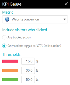
The website conversion KPI gauge can now be tailored to measure actions tagged as a CTA (call to action). This KPI allows you to evaluate the success of your campaign in a single gauge.
Be sure to identify the important action/link by appending :CTA to the tracking name in your web pages before launching the project (e.g., xmp-tracking-action=”Form Submitted:CTA”).
Note: Clicks on the action/link before it has :CTA appended, will not be included in the CTA count.
You can measure unique web conversion using the KPI gauge, and non-unique CTA metrics by downloading the page performance list report from the web analytics page.
You also have the ability to set the threshold of KPI gauges, based on your expectation of the result. For example, assuming that a good email delivery rate would be 95%, then you would set the resolution of the Delivery rate KPI to 100%. You set this expectation in conjunction with the customer you're developing this campaign for.
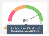
You can see how the KPIs are defined by hovering over a gauge and displaying the tooltip:
If the maximum of five gauges are not displayed on your dashboard by default, you can add another gauge by clicking the menu button at the top right corner of the screen, and selecting Add KPI Gauge.
Note: This option is available only for Administrators and Builders.
The Clear Analytics feature lets you clear the project's analytics before going live and launching the project. This can be useful for cases when you tested your project prior to launching it, and you wish to clear all test analytics before going live.
Analytics for the current project is cleared in the Circle data warehouse only (cloud). It is not cleared from the uProduce tracking database (on prem) of Marketing Console (which has been deprecated), nor is the project history cleared (e.g., event-based automation history).
After running Clear Analytics, the KPI gauges and all touchpoint analytics are reset to zero since there are no longer any events.
Analyze tab (video)