Preset uChart chart options
Summary: This article describes uChart chart options that have preset values that cannot be overridden.
Audience: Users of Adobe InDesign, who use the uChart module of uCreate Print to create charts and graphs .
Prerequisites: Readers of this document should have a basic understanding of the following products:
-
Adobe InDesign
-
XMPie uCreate
-
uChart
Overview
uChart is the XMPie add‐on to uCreate that allows you to create dynamic data‐driven graphical charts and graphs. It integrates the features of Chartbot™, a third party add‐on from Soft Horizons (http://).
XMPie has used some of the Chartbot features for its own purposes and has assigned values which cannot be overridden. This document describes which
Preset uChart Chart Options
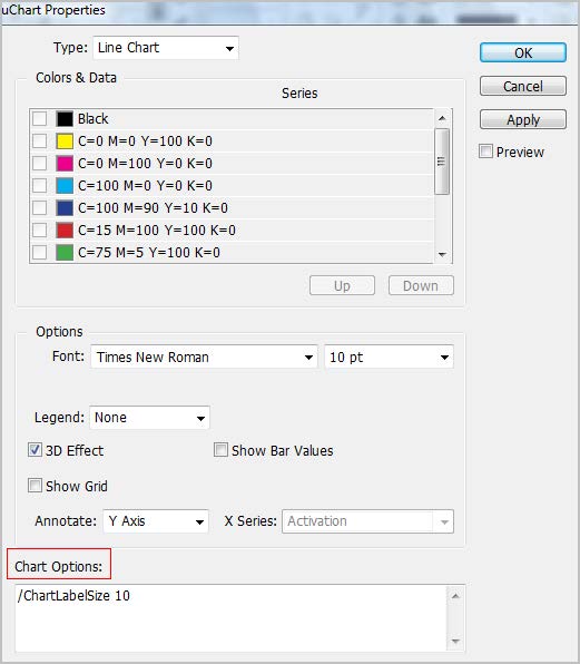
uChart allows you to further enhance the look of your charts by entering Chartbot commands in theChart Optionsarea of theuChart Properties dialog:
You can use any Chartbot command to modify your charts except for the commands listed below.
The values of these commands have been pre‐set by XMPie and cannot be overridden. Entering other values will have no effect on the appearance of the chart.
|
Chartbot Command |
Description |
Preset Value |
|
/3DViewAngle |
The viewing angle of the 3D effect. |
|
|
/BarGap The |
The size of the gap between data bars/columns. |
|
|
/Chart |
The type of chart. |
The chart type is determined by the value selected in the Type field of the uChart Properties dialog and cannot be overridden. Possible values are Pie Chart, Column Chart, Line Chart, Area Chart and Compound Chart. |
|
/ColorList |
A list of the colors of the chart’s bars, lines and slices. |
The CMYK color selection in theColors Datatable in theuChart Propertiesdialog |
|
/CutoutText |
Text is "cut out" from its surroundings when onchart values overlap the data line making it easier to read. |
Yes |
|
/FillBelow |
In Area charts, the area below data line is filled in. The color of the area is determined by the /ColorList processing. The data line color must be set using / |
Yes |
|
/GroupGap |
The space between data groups (instead of /BarGap). |
|
|
/Hyphenate |
Words using Adobe CID fonts (a large format normally used in Chinese, Japanese and Korean) are not hyphenated. |
No |
|
/LabelOverflow |
When on‐chart label text is too long, the text is automatically adjusted so that it shrinks in steps until it fits the space allocated. |
ShrinkToFit |
|
/Layering |
In multi‐dimensional charts, each layer of data represents a dimension. This command controls how the data layers are displayed in relation to each other. |
|
|
/LayerLabel |
Sets the LayerLabel text associated with a Layer. |
According to layer input. (This option can be overridden with the GUI.) |
|
/LayerLabelLocation |
The location of the layer label on the chart. |
|
|
/LeftTextLimit |
The leftmost limit for text. No text will be rendered to the left of this position. |
According to input offset from the chart, determined automatically from box bounds |
|
/LegendOutlineWidth |
The width of the line around each color spot in the legend. |
1 |
|
/LegendOverflow |
When the text in the legend is too long, the, text is automatically adjusted so that it shrinks in steps until it fits. |
ShrinkToFit |
|
/MarkerSize |
The size of on‐line data point markers. |
8 |
|
/OutlineStyle |
The drawing style of the lines in line charts and the edging of bars and pies. |
|
|
/OutlineWidth |
There is no “edging” line on bars, lines and slices. |
0 |
|
/PrintLeftAxis |
Shows the vertical axis on the left edge of bar or line chart. |
Yes |
|
/PrintLeftScale |
Shows scale numbers along the left of bar and line charts when Y Axis is selected as an option for the Annotate field. |
|
|
/RightTextLimit |
The right most limit for text. No text will be rendered to the right of this position. |
According to input offset from chart, determined automatically from box bounds |
|
/SliceCutaway |
The space between slices in Pie Charts. |
|
|
/ValueOverflow |
When on‐chart value text is too long for the value or space defined, text is automatically adjusted so that it shrinks in steps until it fits. |
ShrinkToFit |
Note: Although you cannot change how existing data affects the look of your charts, you can add more data. For Pie charts you can add more slices and for multi‐dimensional graphs you can add additional layers with other data series.
Created by: Gal Kahana, last updated: August 12, 2010