 View what's in this topic
Working with uChart
uChart is an XMPie add-on to uCreate Print, which allows you to create dynamic data driven graphical charts and graphs.
uChart integrates the features of ChartbotTM, a third-party add-on from Soft Horizons (http://wowem.com/consulting.htm)
XMPie has used some of the Chartbot features for its own purposes and has assigned values that cannot be overridden.
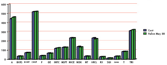
You can customize the chart properties to suit your specific needs: choose between different types of charts -pie chart, bar, line etc.; define the color scheme, choose whether or not to display labels, etc. An example dynamic chart is shown in the following figure:
To create a dynamic chart, simply tag a graphic frame with a table content object.
Note that you must have a uChart license to create dynamic charts. If you do not have a license, the dynamic charts will appear with a watermark.
To tag a graphic frame with a table content object:
-
Using any of the graphic frame tool icons, draw a placeholder frame in the document.
-
In the Dynamic Content panel, double-click the relevant table content object.
The graphic frame displays a chart icon (pie chart), indicating that the frame has been tagged with the selected table content object.
At this stage, the chart icon does not reflect the table content object data. It only indicates this graphic frame is tagged with a table content object, and that you should now configure the chart properties, as explained in the following steps.
-
Specify how the table content object data should be presented in this chart, by right clicking anywhere in the graphic frame and selecting Dynamic Content > uChart Properties.
The uChart Properties dialog is displayed.
-
Set the chart properties as explained in the table below.
-
When the table content object column values populate the chart, the appropriate dynamic chart is displayed for each recipient.
The uChart Properties dialog includes the following options:
|
Option |
Description |
|---|---|
|
Type |
Select the desired type of chart: Pie, Bar, Line, Area or Compound. The options in this dialog differ slightly, depending on the selected type of chart. This table lists options that are common to all types of charts, followed by type-specific options. |
|
Common options |
The following options are common to all types of charts:Colors & Data, Preview, Font, Legend, 3D Effect and Chart Options. |
|
Colors & Data |
Choose the colors in which the graphic will be shown (to add colors to the list, choose Windows > Swatches from the InDesign menu).
When using a Compound chart, the last selected color in the Color list is assigned to the Line graph. |
|
Preview |
See a preview of the graphic, reflecting the properties you currently specifying in this dialog. Note that your changes are saved only after you click OK or Apply. |
|
Font |
Select the font typeface and size of all text
appearances |
|
Legend |
Add a legend by choosing its location with respect to the graphic from the drop-down list. Available options include None, Left or Right. Pie charts include additional options: Circular and Legend Only, which can be set per slice (that is, per table content object column). |
|
3D Effect |
Add a three dimensional perspective to the graphic. |
|
Chart Options |
Enter a command to enhance the look of your chart. Available commands are listed in Using Enhanced Options. |
|
Options (Pie Chart only) |
|
|
Separate Slices |
Break apart and separate the different slices of the chart. |
|
Merge Small Slices |
Combine all slices whose value is less than a specified amount into a single slice. |
|
If less than |
Specify the minimal percentage of the data a value must represent in order to be displayed as a separate slice. All slices whose values are lower than this percentage will be combined into a single general slice, whose default Title is Other. |
|
Title |
Enter the title to be given to the general slice, which merges all Small Slices whose values are less than the specified percentage. The default Title is Other. |
|
Options (Bar, Line or Area) |
|
|
Show Bar Values |
Include the bar values in the graphic. |
|
Show Grid |
Display the graphic on a grid. |
|
Annotate |
Specify which of the axes on which the graphic is displayed are to be annotated. Available options are None, X Axis, Y Axis and Both Axes. |
|
X Series |
Select the table content object column to be used as the graphic’s X-axis from the drop-down list. |
To remove a table content object from a graphic frame:
-
Right click the tagged graphic frame and choose DynamicContent > Remove Content Object from Graphic.
Enhanced options
uChart allows you to further enhance the look of your charts by simply entering commands in the Chart Options area of the uChart Properties dialog.
When entering uChart parameters, take into account that:
-
Each parameter should be entered in a new line.
-
Parameter names are case sensitive.
-
Parameter names do not contain spaces.
-
Parameter names must be preceded with a forward slash '/' with no spaces between the parameter name and the slash.
-
Parameter names must be followed with a space.
The commonly used parameters are listed in the following table (the “Applicable To...” column indicates the chart type by its initial: B=Bar, L=Line, P=Pie). You can access additional parameters from the Chartbot reference guide and Chartbot samples document.
|
Parameters |
Values |
Effect |
Applicable To |
|---|---|---|---|
|
/3DDepth |
0.0 to 1.0 |
“Depth” of 3D effect |
BLP |
|
/3DViewAngle |
0 to 90 |
Apparent position of 3D effect’s point of view |
BLP |
|
/Aspect |
0.1 to 10.0 |
Overall chart width |
BLP |
|
/AxisColor |
color |
Color of all axes |
BL |
|
/AxisStyle |
lineStyle |
Drawing style of axes |
BL |
|
/AxisWidth |
0 to 1000 |
Width of all axes |
BL |
|
/BarGap |
0 to 100.0 |
Size of the inter-bar gaps |
B |
|
/CalloutLayout |
Around, Side |
Layout of pie chart’s callout lines |
P |
|
/CalloutLineColor |
color |
Color of callout lines |
P |
|
/CalloutLineLength |
0.04 to 1.0 |
Callout line length |
P |
|
/CalloutLineStyle |
llineStyle |
Style of callout lines |
P |
|
/CalloutLineWidth |
0 to 9999 |
Width of callout lines |
P |
|
/ChartLabelSize |
0.1 to 100 |
On-chart value text size |
BLP |
|
/ChartValueSize |
0.1 to 1000 |
On-chart value text size |
BLP |
|
/ColorListLabels |
[(label1)... (labelN)] |
Drawing color for specific labels |
BLP |
|
/CompressHighLow |
No, Yes |
Compress out bottom space |
BL |
|
/CutoutText |
No, Yes |
“Cut out” text from surroundings |
BLP |
|
/FillBelow |
No, Yes |
Fill in space below data line |
L |
|
/FloorSize |
0.1 to 100 |
Font height of Floor text |
BL |
|
/GridLineColor |
color |
Color of grid |
BL |
|
/GridLineStyle |
lineStyle |
Drawing style of grid lines |
BL |
|
/GridLineWidth |
0 to 1000.0 |
Width of grid lines |
BL |
|
/GroupGap |
0 to 10.0 |
Inter-group space |
BL |
|
/GroupSize |
0.1 to 100 |
Font height of Group text |
BL |
|
/HighValue |
number |
Top of range for data values |
BL |
|
/KeepZeroData |
Yes, No |
Discard 0-valued data |
BLP |
|
/LabelColor |
color |
Color of labels |
BLP |
|
/LabelFormat |
(stringFormat) |
Transforms label text |
BLP |
|
/LabelLocation |
location |
On-chart label-value location |
BL |
|
/LabelLocation |
location |
On-chart label-value location |
P |
|
/LabelOverflow |
Ignore,... |
Clipping of on-chart labels that are too long |
BLP |
|
/Layer |
|
Begin layer data; Separates layers |
B |
|
/Layering Overlay, |
Group, Interleave |
Grouping of data layers |
BL |
|
/LayerLabel |
(text) |
LayerLabel text for layers |
BL |
|
/LayerLabelFormat |
(stringFormat) |
Transforms /LayerLabel text |
BL |
|
/LayerLabelLocation |
location |
Location of /LayerLabel |
BL |
|
/LeftGap |
1.0 to 10.0 |
Gap width before left most column |
BL |
|
/LeftScaleFormat |
(numberFormat) |
Formatting of scale numbers |
BL |
|
/LeftScaleSize |
0.1 to 100 |
Font height of scale numbers |
BL |
|
/LeftTextLimit |
1000.0 to 1000.0 |
Left most limit for text |
BLP |
|
/LegendOutlineWidth |
0 to 10.0 |
Width of spots’ outlines in legend |
BLP |
|
/LegendOverflow |
Ignore,... |
Clipping of chart legends that are too long |
BLP |
|
/LegendPosition |
1.0 to 10.0 |
Shifts legend to right |
BLP |
|
/LegendSize |
0.1 to 100 |
Size of Legend spot and text |
BLP |
|
/LineFromOrigin |
No, Yes |
Draws an initial line |
L |
|
/LowValue |
number |
Bottom of range |
BL |
|
/MarkerColor |
color |
Color of data point markers |
L |
|
/MarkerShape |
shape |
Shape of data point markers |
L |
|
/MarkerSize |
0 to 9999 |
Size of data point markers |
L |
|
/MaxGridDivisions |
1 to 10 |
Max number vertical divisions |
BL |
|
/MergeLabels |
No, Yes |
Merge same-label data |
BLP |
|
/NegativeColor |
color |
Color of negative data |
BLP |
|
/OutlineColor |
color |
Color of edging lines |
BLP |
|
/OutlineStyle |
lineStyle |
Drawing style of lines/edging |
BLP |
|
/OutlineWidth |
0 to 1000.0 |
Width of edging |
BLP |
|
/PieType |
FullPie, HalfPieUp, HalfPieDown |
Overall shape of pie charts |
P |
|
/PieValueInPercent |
Yes, No, or 0 to 5 |
Print pie data as %; force total = 100% (int) |
P |
|
/PrintBottomAxis |
Yes, No |
Show/hide zero-axis |
BL |
|
/PrintBottomTics |
No, Yes, IfLabel |
Print tic marks on bottom |
BL |
|
/PrintCalloutLine |
IfNeeded, No, Yes |
Print callout lines |
P |
|
/PrintFloor |
No, Yes |
Show/hide line below axis |
BL |
|
/PrintGrid |
Yes, No |
Show/hide grid lines |
BL |
|
/PrintLabel |
Yes, No, ExceptPlaceholder |
Show/hide data labels |
BLP |
|
/PrintLeftAxis |
Yes, No |
Show/hide left vertical axis |
BL |
|
/PrintLeftScale |
Yes, No |
Show/hides left scale numbers |
BL |
|
/PrintLeftTics |
Yes, No |
Show/hide left “tic” marks |
BL |
|
/PrintValue |
Yes, No |
Show/hide data labels |
BLP |
|
/RightGap |
1.0 to 10.0 |
Gap width after right most column |
BL |
|
/RightTextLimit - |
1000.0 to 1000.0 |
Right most limit for text |
BLP |
|
/SliceCutaway |
0.0 to 0.5 |
Space between pie slices |
P |
|
/TextShrinkList |
[list of .99 to .2] |
Text-reduction steps for ShrinkToFit |
BLP |
|
/ValueColor |
color |
Color of values |
BLP |
|
/ValueFormat |
(numberFormat) |
Formatting of values |
BLP |
|
/ValueLocation |
|
On-chart location of values |
BL |
|
/ValueLocation |
|
On-chart location of values |
P |
|
/ValueOverflow |
|
Clipping of on-chart values that are too long |
BLP |
In the following example we have taken a regular two-dimensional bar graph.
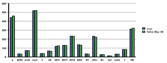
We have changed the graph’s color and 3D properties as follows:
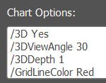
-
We first enabled three dimensional view by issuing the command '/3D Yes'.
-
Next, we have set the “depth” of the 3D effect to 30 degrees (/3DViewAngle 30) and the apparent position of the 3D effect’s point of view to '1' (/3DDepth 1).
-
Finally, we changed the color of the chart's grid from black to red (/GridLineColor Red). The resulting bar graph is now as follows: