Skins
Note: Skins are used in legacy stores only.
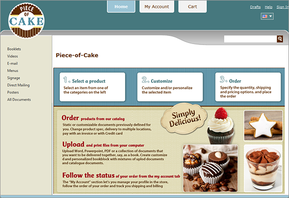
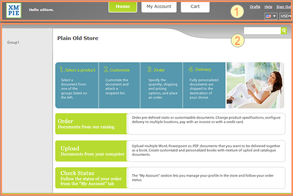
Overview
You can control the look and feel of your stores by either selecting one of the uStore default skins or using your own custom skin instead. If you want to use your own skin, you need to prepare it in advance. uStore supports two types of skins: desktop and mobile. The default XMPieGreen skin is also adapted for mobile devices. The skins are designed with active CSS and can easily be modified using HTML5 Base.
You can download existing skins to customize them, upload new skins, and replace an existing skin with a new skin.
It is highly recommended that you download the skin as backup before deleting or replacing it.
To select a skin:
-
Go to Store Setting > Set up Store, and click the Appearance tab.
-
In the Store Skin section, select the required skin from the Skin Name list.
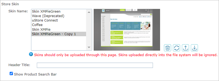
For uStore Connect stores, make sure to select a skin that matches the appearance of the third-party e-commerce application.
-
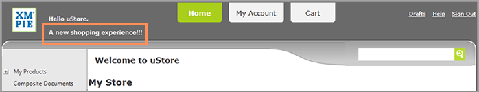
If you want to add a header title to your store, enter it in the Header Title box. This will be displayed in the store Welcome page.
-
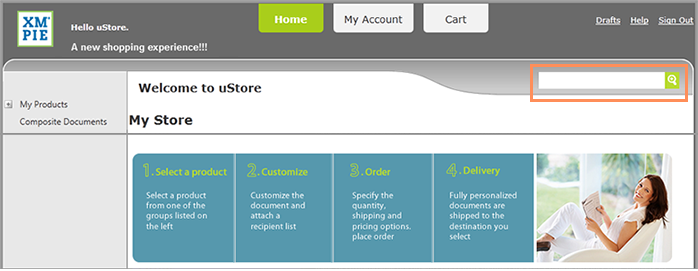
Select the Show Product Search Bar to enable the product search bar in your store’s Home page and Product List page.
The product search bar enables customers to quickly find products by product name, product description and key words.
Customize skins
This section reviews the main components and principles of the Skin XMPieGreen skin and explains how you can customize it for branding and design purposes.
This information is designed for web designers. To be able to take full advantage of the provided information, you need to be knowledgeable in HTML and CSS editing.
Main elements
The XMPie skin mechanism was designed to provide maximum layout, flexibility, reduced page weight and faster page loads.
The following figures illustrate the flexibility of the XMPieGreen skin. The customized skin was achieved by making relatively small changes in the CSS definitions.
Default XMPieGreen skin
Customized skin based on the XMPieGreen skin
Main skin files
The main skin files are located in the Images folder:
|
File |
Description |
|---|---|
|
Style.css |
Main style sheet |
|
Popup.css |
Styles for popup windows |
|
FileSubmission.css |
Styles used for the document builder pages |
|
Common.skin |
Maps additional skin IDs to their style |
|
XmpImageButton.skin |
Maps each button’s skin ID to its css class |
|
jquery-ui.custom.css |
Styles for the jquery controls used in uStore |
General page layout
The default page layout includes the following areas:
|
|
Header |
|
|
Content area |


The following selectors, found in the Style.css define the general styles used throughout the page layouts:
|
Selector |
Description |
|---|---|
|
#fullpage |
Defines the page width |
|
Html |
Defines the store background |
Header
The header consists of the following elements:

|
|
Logo: Your company’s logo |
|
|
User Welcome: Salutation defined in the uStore backoffice by the uStore administrator |
|
|
Menu buttons: Navigation menu buttons to the store’s main pages |
|
|
Localization and currencies menu: Enables the user to select a language to view the store’s interface and a currency to use for purchases in the store. |
|
|
Links to: |
|
|
|


Most of the header elements have an absolute positioning on the page. This means that you can easily change their position.
Following are the header elements:
|
Element |
Selector /Class |
Image file |
Positioning |
|---|---|---|---|
|
Logo |
#logo |
Logo.jpg |
Absolute |
|
User Welcome |
.userWelcome |
|
Absolute |
|
Menu buttons |
.menuButton .menuButton:hover .menuButton.selected a .menuButton.color:hover .menuButton.selected.color .menuButton a |
|
|
|
Localization and currencies menu |
XmpImageDropDownList Toggle Choices flagList dropDownCurrencies Note: Properties are set using combinations of these classes. |
|
Absolute |
|
Drafts, Help and Sign Out links |
header li.links |
|
Absolute |
Content area
The content area includes the following sections, all displayed over a background image:
|
|
Product Group tree: The menu on the left pane of the page. |
|
|
Homepage Title: the name of the store. |
|
|
Product Search box: A box at the top right corner of the page that enables visitors to search for products in the store. |
|
|
Homepage: The area that includes the main content of the page. |
Following are the content area elements:
|
Element |
Selector /Class |
Image file |
|---|---|---|
|
Background image (wave) |
.ThemedPageMaster #bodyarea. |
leftBanner.png |
|
Store title |
.title |
|
|
Search box |
.productSearchBox |
|
|
Search box input area |
.productSearchBox input[type=input] |
|
|
Search button |
.productSearchBox input[type=submit] |
magnifing-glass.png |
|
Background color of the product tree |
.ThemedPageMaster #bodyarea:before |
|
|
Width of the product tree |
.ThemedPageMaster #bodyarea:before #navArea .treeViewContainer. |
|
|
Homepage |
|
store.png |
Facebook login button
uStore administrators can enable storefront customers to log in to a store using their Facebook credentials. When the Facebook login feature is used, a new box appears in the Sign-in page with the Facebook Login button.
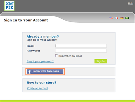
The following class controls the Facebook login button: singleSignOnButtonFacebook
LivePerson chat button
uStore administrators can add a chat button to all storefront pages. By default the LivePerson chat button is located at the lower left corner of every page.
The following selector controls the LivePerson chat button style: .LivePersonButton_Skin
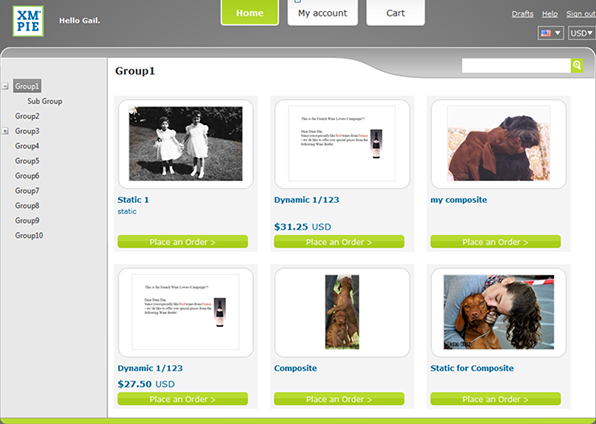
Product list page
The product list is displayed as either a list or a grid, depending on the settings defined on the Store Setup > Appearance tab in the uStore backoffice.
The following is the Product List page displayed as a grid:
The following are selectors that control the Product List page:
|
Element |
Selector /Class |
|---|---|
|
Basic Properties |
.XmpImageButton |
|
Product List |
productListTable productlistview productgridview thumbnail productInfo productname productdesc productQtyRange productPrice productDetailsLink overlay productEnlarge productDownload |
Product details and customization pages
The product details and customization pages include the purchasing workflow, from providing information about a selected product to the checkout steps. The elements displayed on these pages and their layout depends greatly on the settings defined by the uStore administrator on the uStore backoffice.
Layout of the Product Details and Customization pages:
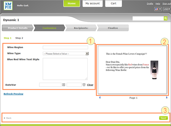
|
|
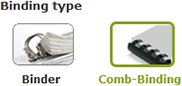
DUC customization controls |
|
|
Product preview area |
|
|
Footer |
In the Customize step, by default, the labels for the DUC customization controls appear to the left and at the same height of the input control as can be seen in the above image. If you want to place the labels above the customization controls and align them to the left, add the following rule:
.Duc dt, .Duc dd

{

float:inherit;

margin-left: 10px;

padding: 0;

}
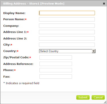
Popup windows
The uStore user interface includes a few pop-up windows. The Billing Address dialog box, which enables the visitor to enter the billing address for a specific order, is an example of a pop-up window:
Following are the pop-up window styles:
|
Styles |
CSS File |
Selector |
|---|---|---|
|
Styles within the pop-up window |
Popup.CSS |
|
|
Style of the pop-up window itself |
jquery-ui.custom.CSS |
ui-dialog(several selectors) For example, edit the .ui-dialog-title selector to change the style of the pop-up window title. |
Color scheme
Use the following CSS selectors to edit your skin’s color schemes.
Selectors in the Style.css and Popup.css
Following is a list of the color schemes that you control via selectors located in the Style.css and Popup.css files.
|
Color Schemes |
Selector |
Sample Images |
|---|---|---|
|
Theme buttons |
.XmpieThemeColorButton .XmpieThemeColorButton:hover .XmpieThemeColorButton.Hover .XmpieThemeColorButton:active |
|
|
Background colors of the order approval buttons |
.XmpieApproveButton:hover .XmpieApproveButton:active |
|
|
Colors of the options shown in the Gallery List View and Gallery Grid View controls |
.FieldOptionItem.FOGrid.selected .optionTitle .FieldOptionItem.selected.FOGrid .optionIcon |
|
|
Color of current customization step |
.btnSelected a:link |
|
|
Color of the current wizard step |
.WizStepTR[stepStatus='active'] .WizStepTRSel[stepStatus='active'] |
|
|
Color of the current wizard step when multiple shipping addresses are enabled |
.WizardStepHeadingCurrent |
|


Selectors in the FileSubmission.css
Following is a list of the color schemes that you control via selectors located in the FileSubmission.css file.
|
Color Schemes |
Selector |
Sample Images |
|---|---|---|
|
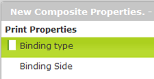
Properties pop-up in the document builder step |
.VerticalMenuDiv ul li:hover .VerticalMenuDiv_ul_li_active |
|
|
Preflight pop-up in the document builder step |
infoToggleArea |
|
Font styling
Use the following CSS selectors to set the font style:
|
CSS File |
Selector |
|---|---|
|
Style.CSS Popup.CSS |
Body FormButton DIV.LoadingDivHeader |
|
jquery-ui.custom.CSS |
.ui-widget .ui-widget input .ui-widget select .ui-widget textarea .ui-widget button |
Images
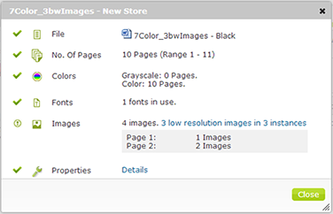
You can make any changes to images as long as you do not change the file name. Images used in the document builder process are found in the File Submission folder.
The following tables list images that would most probably need editing to match a new branding or color scheme.
 General images
Following is a list of the main images used in the general layout.
Location: <uStore Installation Drive>:\XMPie\uStore\App\CustomerApp\Images\[Your_Skin_Name]
|
File Name |
Image |
|---|---|
|
Logo.jpg |
|
|
Store.png |
|
|
Proof_left.png |
|
|
proofRight.png |
|
|
ProofBtn.png |
|


 Document builder images
Following is a list of the main images and buttons used on the Document Builder pages.
Location: <uStore Installation Drive>:\XMPie\uStore\App\CustomerApp\Images\[Your_Skin_Name]\FileSubmission
|
File Name |
Image |
|---|---|
|
IconWrench.png |
|
|
Wrench_Clicked.png |
|
|
emptyDoc1_Hover.png |
|
|
emptyDoc1_Clicked.png
|
|
|
emptyDoc2_Hover.png |
Same as emptyDoc1_Hover.png |
|
emptyDoc2_Clicked.png |
Same as emptyDoc1_Clicked.png |
|
emptyDoc3_Hover.png |
Same as emptyDoc1_Hover.png |
|
emptyDoc3_Clicked.png |
Same as emptyDoc1_Clicked.png |
|
Chapter_Sprite.png |
|
|
Page_Sprite.png |
|
|
CompositeProof_Sprite.png |
|
|
IconTrash.png |
|
|
IconPreflight.png |
|
|
fileWarning.png |
|
|
IconColors.png |
|
|
IconFonts.png |
|
|
IconImages.png |
|
|
IconWarning.png |
|
|
IconWarningBig.png |
|
|
AddItem.png |
|
|
processingGif.gif |
|
|
IconApproved.png |
|
|
IconFile.png |
|
|
IconMagnify.png |
|
|
IconMove.png |
|
|
IconPages.png |
|
|
IconProperties.png |
|
|
Document_Hover.png |
|
|
/progressBar/bar.gif |
|


Master pages
Note: Only advanced users who are familiar with ASP.NET should work with master pages.
If you need to make more complex changes to your storefront pages so that they comply with your organization’s branding or website structure requirements, you need to create new master pages.
Master pages determine the page layout of your storefront pages. Master pages affect page elements, such as the header, content area and footer. In addition, you may want to modify a master page to add code and other elements, such as widgets, banners and additional functionality.
uStore’s default master pages are located at:
<uStore Installation Drive>:\XMPie\uStore\App\CustomerApp\PageLayout
There are four default master page files:
-
Popup.Master
-
ThemedPage.Master
-
ThemedPageFullWidth.Master
-
Login.Master
Create new master pages
Create a new master page based on one of the existing master files. First you need to copy the master page file that you want to modify to the same folder of your new skin. Any changes that you make to the master file take effect only if the master file is located directly under the skin folder.
To copy a master file to your new skin folder:
-
On the uStore server, browse to <uStore Installation Drive>:\xmpie\ustore\App\CustomerApp\PageLayout.
-
Copy the required master file from the PageLayout folder to the skin folder. For example, copy the file ThemedPage.Master to: <uStore Installation Drive>:\xmpie\ustore\App\uStoreShared\Skins\Images\<new_skin_folder>.
-
Make the required changes to the master file and save it.