Composite Products give the end-user the option of creating his own document by combining selected components into a single document. When placing an order, the end-user selects the component files to be included in the final print document. Components can be Static Documents, Dynamic Documents or documents uploaded by the end-user. Users can upload Word Documents, PowerPoint presentations and PDF files.
The topics of this section describe how to create a Composite Product and how Composite Products differ from other products in the store.
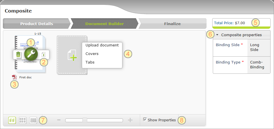
The following is a page in the storefront where the end-user builds a Composite Product. In it are marked the elements that need to be configured when creating a Composite Product.
Following is a description of each element and when relevant, a reference to where you can learn more about how to configure the element:
|
Tools icon: Enables the end-user to set component’s properties and customization settings. You define the properties and customization settings when you set up a component, such as a Dynamic, Static or Upload Product. |
|
Preflight icon: When the end-user clicks the Preflight icon, uStore performs a print preflight. The preflight feature is automatically added. You don’t need to configure it. |
|
File name and format icon: The file format icon is displayed for uploaded documents only. The end-user may change the file name. |
|
Add Components list: Enables the end-user to upload his own documents or select documents from preconfigured Product Groups. – Upload document: Appears in the list only if you enabled it in the Back Office application. To learn how to configure the Upload Product, see Setting Up Upload Products. – Product group names: You define Component Groups in the Component Group (hidden) section. In the Composite Component Setup section, you select the groups to be displayed in the list. To learn how to add product groups to the list, see Adding Composite Components. |
|
Total Price: Displays the total price of all the elements used to build the final composite booklet. The sum is updated online according to the end-user selections. Note that the prices of Upload Products are calculated per page. |
|
Composite Properties: Displays the composite properties. To learn how to define these properties, see Composite Product Properties Setup. You can also add dependency between properties. To learn how you do this, see Creating a Dependency Between Product Properties. |
|
Preview icon: Provides a realistic display of the composite booklet. To learn how to create the Preview capability, see Creating a Preview Campaign. |
|
Show Properties: Enables the end-user to visualize how a selected property, such as a binding method, affects each component. For example, if the user selected the binding type comb-binding, an illustration of the comb-binder is displayed with the thumbnail as shown above. To learn how you enable this feature, see Creating Property Option Overlay Images. |


