
 View what's in this topic
Rule Editor
A content object's rule is an expression that calculates the object's value for each recipient — for example, a rule that returns "Mr." for male recipients and "Ms." for female ones, or a rule that builds a personalized greeting from a recipient's first name. The rule editor is the dialog where you create and edit these expressions, either by writing them directly as QLingo, or by building them visually.
To open the rule editor, right-click a content object or variable in the Dynamic Content panel and select Edit Rule NG. The window title reflects what you are editing — for example, Edit Content Object <name>, Edit Variable <name> or Edit Audience <name>.
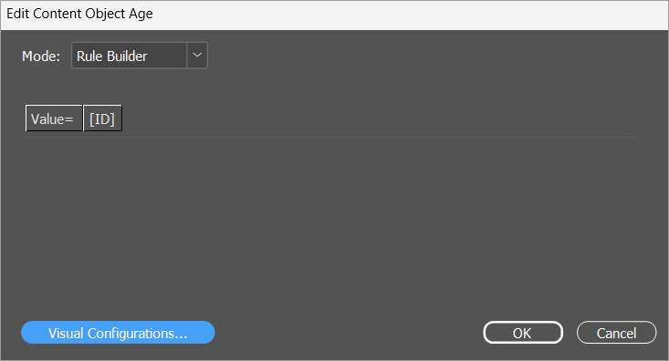
Modes
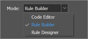
The Mode dropdown at the top of the rule editor controls how the rule is presented:
-
Code Editor: The plain QLingo text editor.
-
Rule Builder: The visual, element-based editor. This is the default for most content objects.
-
Rule Designer: A specialized editor, available only for Table, Multi-Page PDF Table and Personalized Image (uImage) content objects, and for audience-linked content objects and variables. When you open the rule editor for one of these, it starts in Rule Designer automatically.
Code Editor and Rule Builder stay in sync with each other: a change made in one shows in the other as soon as you switch. When Rule Designer is available, it stays in sync with both.
Rule Builder elements
In Rule Builder, the rule appears as a sequence of clickable elements. Each element is either:
-
a value — a constant, an input data field, a variable, or a function call;
-
an operator
-
a control-flow keyword such as If, Then, Else and Switch.
To modify the rule, click an element and pick an action from its menu: replace the element with a different value, extend it with an operator, group it in parentheses, or remove it with Delete, Remove operator or Remove function. Deleting a value that is one side of an operator removes the operator as well and keeps the other value. The sections that follow describe these actions in detail.
Choose the kind of rule
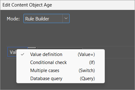
The first element of every rule sets the kind of rule. To change the rule kind, click the first element and select one of the following:
-
Value definition: A plain expression that evaluates to a single value. This is the default for a new rule.
-
Conditional check: An If <condition> Then <value> Else <value> structure. To add more branches, click the Else element and select Else If. To remove a branch, click its Else or Else If element and select Remove.
-
Multiple cases: A switch with one or more cases, optionally followed by a default. To add a case, click any existing case and select Add case before or Add case after. To add the default branch, click any case and select Add default. To remove a case, click it and select Remove.
-
Database query: A rule whose value comes from a query against an external database. A database query can't be edited in Rule Builder. Switch to Code Editor to edit it as QLingo.
You can also nest one kind of rule inside another — for example, place a switch inside one of the branches of a conditional check — by opening the menu of an inner element and selecting Conditional > If or Conditional > Switch.
Insert building blocks
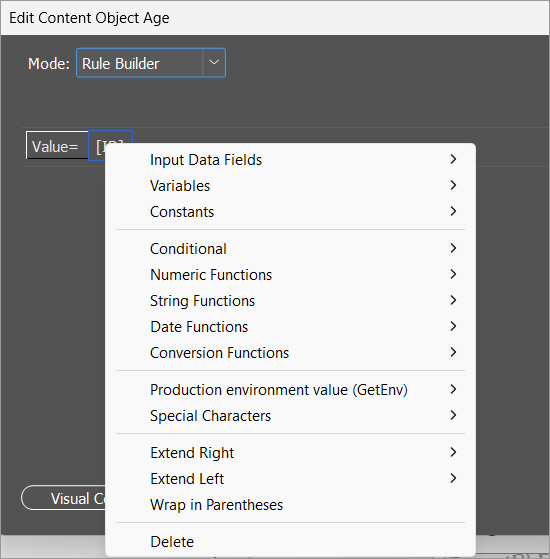
Each element's menu groups the available building blocks into the following submenus:
-
Input Data Fields and Variables: Every input data field or variable defined in the plan. When the list contains more than 30 entries, the submenu shows the first 30 followed by More, which opens a selector with the full list.
-
Constants: Text, Number, Boolean (True), Boolean (False), Date, Empty, Skip. Skip inserts the Skip operator, which skips the current record during job processing (see Skip operator). When the content object can return a file or graphic (such as a graphic content object), the submenu also includes Browse For File, which inserts a string constant with a file path you pick from disk.
-
Conditional: Wrap the current expression in an If or Switch structure.
-
Numeric Functions, String Functions, Date Functions, Conversion Functions: All the QLingo functions, grouped by purpose. For details of each function, see QLingo Language.
-
Custom Functions: JavaScript or QLingo functions defined in the linked plan. Each function appears with its real name and the correct number and types of parameters. This submenu is hidden when the plan defines no custom functions.
-
Graphic Functions: Barcode, rectangle and asset functions. Available when the content object can return a graphic value.
-
Personalized Image (uImage): Inserts a call to uImage() and switches the rule editor to Rule Designer mode for that call. Available when the content object can return a graphic value.
-
Production environment value (GetEnv): The recognized production environment keys, as detailed in GetEnv Functions.
-
Special Characters: End of paragraph (\r), Forced line break (\n), Tab (\t).
Extend the expression
To add an operator or another value next to an existing element, click the element and select Extend Right or Extend Left. Both submenus offer the operators that are valid for the element's data type and for its position in the expression:
-
Arithmetic operators: String concatenation, Addition, Subtraction, Multiplication, Division, Integer division, Modulo.
-
Comparison operators: Equal, Not equal, Greater than or equal, Less than or equal, Greater than, Less than.
-
Logical operators: And, Or.
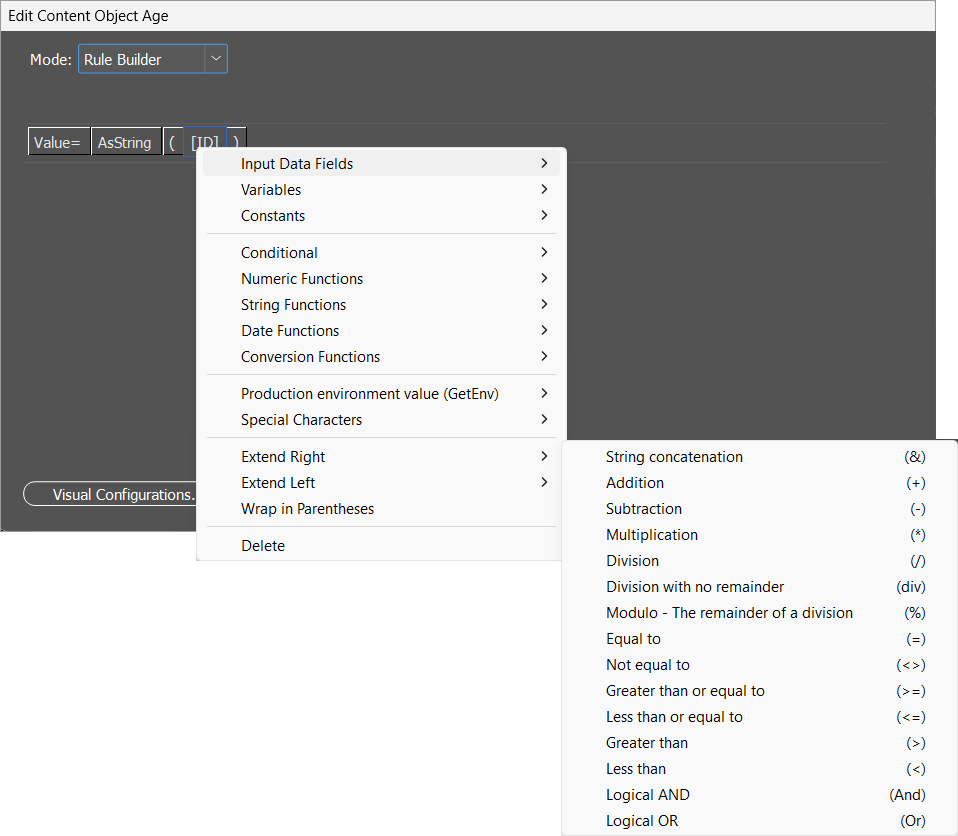
For example, to follow a recipient's first name with a greeting, click the First Name element and select Extend Right > String concatenation. Then click the new empty element, select Constants > Text, and type the greeting.
Extend Left also offers Minus and Logical NOT, which act on a single element rather than connecting two. Minus negates a number (for example, turns [Age] into -[Age]); Logical NOT inverts a True/False value.
Edit function parameters
In a function call, a comma element separates the parameters. To add a parameter, click an existing parameter and select Extend Right (or Extend Left) > Parameter separator (,). To remove a parameter, click the comma element before it and select Remove parameter.
Group with parentheses
To control the order in which arithmetic or logical operators are evaluated, click any element and select Wrap in Parentheses. The element is enclosed in a parenthesized group. To remove the grouping, click one of the parenthesis elements and select Remove Parentheses.
Build a rule
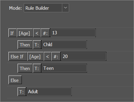
The procedure below uses the techniques described in the preceding sections to build a rule that returns the descriptive text "Child", "Teen" or "Adult" based on the value of an Age input data field. The completed expression reads:
If Age < 13 Then "Child" Else If Age < 20 Then "Teen" Else "Adult"
The procedure assumes a newly created text content object (for example, AgeGroup) that does not yet have a rule. When you open the rule editor for such a content object, the rule starts as a single empty string value next to the Value= label.
To build the example rule:
-
In the Dynamic Content panel, right-click the AgeGroup content object and select Edit Rule NG.
-
Click the Value= element and select Conditional check.
The rule now has the structure of an if-then-else expression: an empty condition, an empty Then value, and an empty Else value.
-
Define the first condition (Age < 13):
-
Click the empty condition element and select Input Data Fields > Age.
-
Click the Age element and select Extend Right > Less than (<).
-
Click the newly created Type element (T: / #: / D:), select Constants > Number, and type 13 in the inline edit box.
-
-
Click the empty Then value, select Constants > Text, and type Child in the inline edit box.
-
Click the Else element and select Else If.
The Else branch now contains a second condition and value pair, followed by a new Else.
-
Define the second condition and value (Age < 20 Then "Teen") by repeating steps 3 and 4 in the new branch, using 20 as the number and Teen as the string.
-
Click the empty Else element, select Constants > Text, and type Adult.
-
Click OK to save the rule.
The completed rule looks like this in Rule Builder:
Define a rule for a table content object
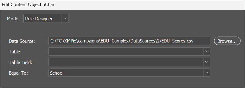
For a Table content object, the rule editor opens in a specialized editor (the Rule Designer) that lets you map a column in an additional data source to a column in the document's main data source.
To define a table content object rule:
-
In the New Content Object dialog, name the content object, set its Type to Table, and click OK.
-
In the Dynamic Content panel, right-click the new content object and select Edit Rule NG.
-
In the Rule Designer, click Browse next to Data Source and select the additional data source.
-
From Table, select the table to use (when the data source contains more than one). For a CSV or other delimited text file, the Table dropdown is replaced by a Separator dropdown, where you select Comma (,), Tab or Semicolon (;), or type a different separator.
-
From Table Field, select the column in the chosen table that uniquely identifies each recipient.
-
From Equal To, select the matching column in the document's main data source.
-
Click OK.
Define a rule for a Multi-Page PDF Table content object
For a Multi-Page PDF Table content object, the rule editor opens in Rule Designer mode with a dedicated panel: a PDF File field (with Browse) where you select the PDF that supplies the table's pages.
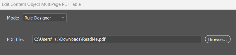
For the full procedure, see Tagging with a Multi-Page PDF Table Content Object.
Define a rule for a Personalized Image (uImage) content object
When a content object's rule is a uImage call, the Rule Editor opens in Rule Designer mode with a layout dedicated to uImage: a Package (with Browse), a Tag Mappings tree, a File Name area, a Format dropdown, and an Advanced button for the output folder and format options.
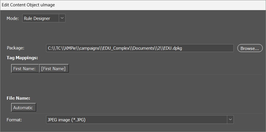
Note: The Advanced button is available only when the package is a regular Photoshop package. For Image Font and Separated Letters packages, the advanced output settings are not available.
For the full procedure and the Advanced uImage Settings, see Defining a uImage Content Object.
Define a rule for an audience-linked content object or variable
If a content object or variable has its Link to Audience option set, the rule editor opens in Rule Designer with one row per segment of the linked audience plus a default row:
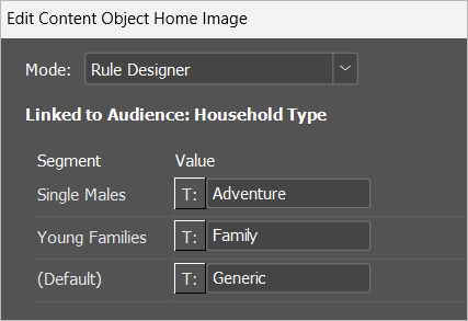
Define an expression for each segment using the same building blocks described earlier in this topic. At runtime, each recipient receives the value from the segment they belong to, or the default value if they don't match any segment. For more information, see Creating an Audience.
Note: In Code Editor and Rule Builder, an audience-linked rule is read-only — it is edited per segment in Rule Designer.
Edit the rule as QLingo
If you prefer to read or write the rule directly as QLingo text, open the Mode dropdown at the top of the rule editor and select Code Editor. Type the expression directly, or paste an expression copied from elsewhere.
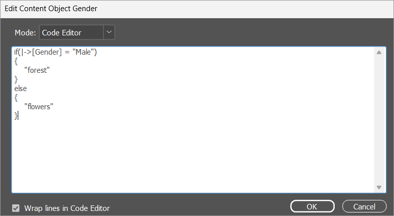
If the QLingo is not valid, the visual builder becomes read-only until the syntax is fixed.
The Code Editor has its own visual option:
-
Wrap lines in Code Editor: When checked, long QLingo expressions wrap onto multiple lines.
To control how long expressions look in the visual builder, use Visual Configurations (see below).
Customize the rule editor appearance
You can customize how elements are drawn in Rule Builder and Rule Designer. In Rule Builder mode, click Visual Configurations at the bottom of the rule editor to open the Visual Configurations dialog.
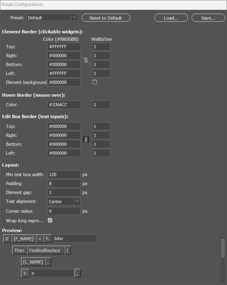
The dialog includes a Preview at the bottom that shows the effect of every change before applying.
Presets
The Preset dropdown applies a complete set of settings in one step:
-
Default: The standard look.
-
Flat, Light Grey, Grey, Dark Grey: Increasingly dark rectangular elements.
-
Rounded: Grey rounded elements with a blue hover.
-
Rounded-White: Dark-grey rounded elements with a white hover.
-
Custom: Set automatically when you change any individual setting.
Selecting a preset overwrites every setting in the dialog. To revert manual changes, click Reset to Default.
To share a configuration with other designers:
-
Save writes the current configuration to a file.
-
Load reads a previously saved configuration file and applies it.
Element Border (clickable widgets)
The border around each clickable element. For each edge (Top, Right, Bottom, Left), set the Color (six-digit hexadecimal number under the Color (#RRGGBB) column, for example #FFFFFF) and the Width in pixels (under the Width/Use column).
To set all four edges together, use the chain toggle between the Color (#RRGGBB) and Width/Use columns:
-
Turn the chain on to link the edges. The Top edge's color and width are copied to the other three edges immediately, and any later edit to one edge is mirrored to the others as you type.
-
Turn the chain off to set each edge independently.
For the Element Border, the chain is off by default. The chain state is saved per user and restored the next time you open the dialog.
Element background: Below the four edges, set the fill Color for elements. The background is applied only when the checkbox in the Width/Use column is selected.
Hover Border (mouse over)
The border around the element currently under the mouse pointer. Set its Color and Width.
Edit Box Border (text inputs)
The border around the editable field inside string, number and date elements. Configured per edge in the same way as the Element Border, including the chain toggle — for the Edit Box Border, the chain is on by default.
Layout
-
Min text box width: Minimum width of editable fields inside elements, in pixels. The field grows automatically as you type a longer value.
-
Padding: Horizontal padding inside the element, in pixels.
-
Element gap: Horizontal gap between adjacent elements, in pixels.
-
Text alignment: Alignment of the text inside elements: Left, Center or Right.
-
Corner radius: Pixel radius of the element's rounded corners. Set to 0 for sharp corners.
-
Wrap long expressions onto multiple lines: When checked, a function call with more than two parameters wraps in Rule Builder so that each parameter appears on its own indented row. (If/Then/Else and Switch structures always appear on multiple rows, regardless of this setting.)
Visual Configurations affects Rule Builder and the element-based parts of Rule Designer. The settings are saved per user.