Setting Up Dial Input Controls
The Input Control section is where you select the type of input required from the customer and specify the values for the selected input control.
The available input controls depend on the dial type you are editing. For example:
-
If the dial is a text content object, the input control can be a text input, a multiline text input, a radio box list advanced, a dropdown list advanced or a gallery list/grid view.
-
If the dial is a graphic content object, the input control can be either an image selector, a popup image selector, an extended image selector, a gallery image selector or a file attachment.
When using the file attachment input control in Labels & Packaging, it is required that the file format for upload is PDF.
Notes:
-
When using the Excel pricing model, you cannot use parentheses or other special characters to name customization dials.
-
You can assign JDF node sets to the following customer input controls: dropdown lists, radio buttons and gallery list or grid view lists.
Text input and multiline text input
Text Input is a standard, single line text box that enables the customer to enter a short, free text input value.
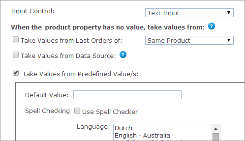
Multiline Text Input is similar to the text input control, but enables the customer to enter several lines of text input.
Once Text Input or Multiline Text Input is selected, you can set each product’s product property values in the When the product property has no value, take values from section. The product property values can be one of the following:
 Take Values from Last Orders of
This option is relevant for the default value selection only. To display values used in the previous orders, select this checkbox and then select one of the following options:
-
Same Product: The value this customer gave this dial in the previous order of this product.
-
All Products in the Store: The value this customer gave this dial in the previous order of any other product. However, if there was already an order from this product, it will take its value. (Note that all products need to be from the same document in the same campaign.)
Take Values from Data Source (not available for StoreFlow Cloud
customers)
This option allows you to retrieve a value for single option controls, such as text boxes, and options and selected values for multiple option controls, such as dropdown lists, from a database, rather than defining them manually.
For example, you can define an input control of type dropdown list that is populated with the customers’ addresses as registered in the uStore database instead of manually defining each entry of the list. This way, you can present each store shopper a personalized list. You can use the predefined uStore databases or you can define a custom database that conforms to the uStore database structure.
Note that you can only use either a global data source (available for all stores) or a data source that was defined for the specific store you are configuring. For more information on how to define a data source, refer to Defining Data Sources.
The Override existing value option instructs uStore to override the existing value of a control, set by the shopper in the storefront, to always reflect the latest database value. This can occur in any page in the store where the property/dial appears, e.g. customization step, finalize step.
Also, when reordering, before the order is placed in the cart, uStore will retrieve the most up-to-date dial/property value from the database.
If left unselected, the value will be retrieved only once, when the dial/property does not have a value.
After you select a data source from the data source list available for the store, use the Wizard option to populate personalized values from the data source, or set the personalized values manually by entering an SQL query in the Custom option.
Wizard
Provide the following information:
-
Table or View: select the table or view from which data is pulled.
-
Display Text Field (Multiple Options Input Controls): the text that is displayed in the input control and is associated with a Value field. For example, the presented text may be an address while the associated value field that is passed on to uProduce is a ZIP code. This selection is available only in multiple input controls.
-
Value Field: select the field (column) in the table or view that will be used to populate the input control. For example, you may have a field in your table or view that stores a recipient names; select that field to populate the input control with names from the Recipient column.
-
Conditions: The wizard enables you to define filters by which the specific value in the Value Field is pulled. You can use the following ID filters:
-
User ID Field - available in the Users table
-
External User ID Field - available in the External Users table
-
User Email Field- available in the User Email table
-
Store ID Field - available in the Stores table
-
Product ID Field - available in the Products table
-
Language ID Field - available in the Culture table
You can also use any desired ID filters provided they are mapped to the above uStore ID filters. If you are defining a single option input control and the filter you are defining returns several records, only the first one will be displayed to the user.
-
Filter (for Dependent Dropdown List only): A column in the database ("Display Text Field") is filtered according to certain criteria. There are three criteria:
Fixed: the column data is filtered by a fixed value. For example, the wine list can be filtered by its color.
Dial: the column data is filtered by the dial selected in the previous dropdown list. Both dials should be of the Dependent Dropdown List type (Dial settings only).
Property: the column data is filtered by the property selected in the previous dropdown list. Both dials should be of the Dependent Dropdown List type (Property settings only).
-
-
Default Field (multiple options input Controls): select the field (column) in the table or view that will be used to set the default value of the input control. Then, enter the specific value in that field that actually sets the default value. For example, the default value field can be 'IsDefault' and the actual values that set the default value can be '1' for 'is default' and '0' for 'not default'. In this case, you should select 'IsDefault' in the Default Field list and enter '1' as its value.
-
Override Default Sorting Field (Multiple Options Input Controls): allows you to sort the input control entries by the order in a specified table field (or view). The sorting order is determined by the data type in the selected field, as follows:
-
lexicographic order for text
-
alphanumeric order for numbers
-
chronological order for dates
-
-
Hide when there are no options to select (for Dependent Dropdown List only): the second dropdown list will appear only if there are values to select.
For example, if you choose USA from the Country dropdown list, the State dropdown list will appear; but if you choose England from the Country list, the State list will not be shown.
For this option to work, the data for the first dropdown list and the data for the second dropdown list must be in separate tables. For example, you should have one table for the list of countries that contains a field for CountryID and another field for CountryName. You will then need a separate table for the list of states with a field for StateID, Country and Name.
Custom
To manually define the Data Source for personalized values, select Custom and enter an SQL query in the Query field.
-
If you are using a single option Input Control such as a Text Box, you should enter a query that returns a single value. You should use one or more of the following parameters: @UserID, @StoreID, @ProductID, @CultureID, @OrderProductID (which is @OrderItemID), @ExternalUserID, @UserEmail.
-
If you are using a multiple options input control such as a Dropdown list, you should enter a query that can return several values. You should use one or more of the following parameters: @UserID, @StoreID, @ProductID, @CultureID, @OrderProductID (which is @OrderItemID), @ExternalUserID, @UserEmail.
Take Values from Predefined Value(s)
-
Default Value: the dial’s default value, which may be overridden by the customer. You can also create a list of values to be used as default values when necessary. To add a fixed value to the value list, enter the value text in Text field and click Add.
-
Spell Checking: applies only to textual dials and properties that implement text or multiline text input controls. To use the spell checker in a textual control, select the Use Spell Check checkbox, and then select a language from the Language list.
You can select both the Take Values from Data Source and the Take values from Predefined Value(s) options. In that case, if a value is missing in the Data Source, it will be taken from the values set in the predefined list.
Notes:
-
You can enrich the text input and multiline text input controls by using the Rich Text Editor.
-
When a Text Input or Multiline Text input control is defined for a dynamic document that is used as a composite component, the storefront user will be able to enter a customized or a personalized value. If during customization, the storefront user enters a value in the text box, it will be used as customized value. However, if the user leaves this text box empty, it will then be added as a column to the recipient list, and he will be able to enter different values for each recipient and personalize this field.
Date time picker
The Date Time Picker control enables customers to specify a date and/or time attribute for an order. You can set the Date Time picker to function as a popup (opens when clicked on) or as inline (always visible). You can also set the date picker to a predefined period of time by using the Earliest and Latest date options. Use the Earliest and Latest date options to set predefined dates or dates relative to an order date (for example: X days after an order has been made).
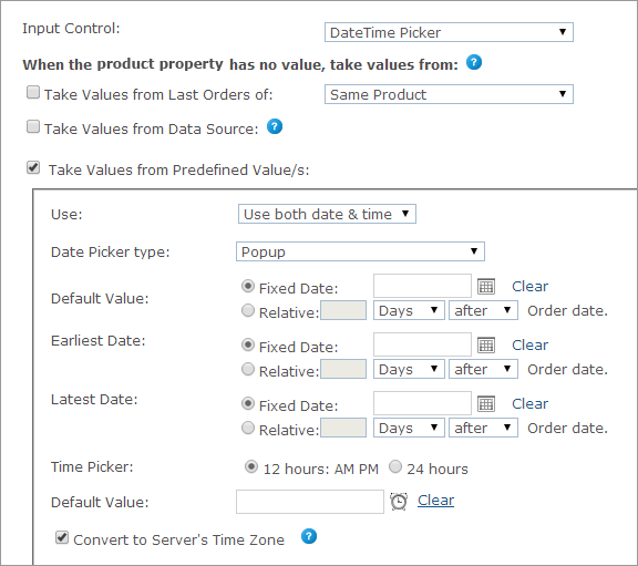
Once the Date Time Picker control is selected, you can set each product’s product property values in the When the product property has no value, take values from section.
Note that the Use list enables you to adjust the property to your needs; that is if you need just the date property, use the Usedate only option, and if you need the time property, use Use time only.
The product property values can be one of the following:
Take Values from Last Orders of
This option is relevant for the default value selection only. To display values used in the previous orders, select this checkbox and then select one of the following options:
-
Same Product: The value this customer gave this dial in the previous order of this product.
-
All Products in the Store: The value this customer gave this dial in the previous order of any other product. However, if there was already an order from this product, it will take its value. (Note that all products need to be from the same document in the same campaign.)
Take Values from Data Source (not available for StoreFlow Cloud customers)
This option allows you to retrieve a value for single option controls, such as text boxes, and options and selected values for multiple option controls, such as dropdown lists, from a database, rather than defining them manually.
For example, you can define an input control of type dropdown list that is populated with the customers’ addresses as registered in the uStore database instead of manually defining each entry of the list. This way, you can present each store shopper a personalized list. You can use the predefined uStore databases or you can define a custom database that conforms to the uStore database structure.
Note that you can only use either a global data source (available for all stores) or a data source that was defined for the specific store you are configuring. For more information on how to define a data source, refer to Defining Data Sources.
The Override existing value option instructs uStore to override the existing value of a control, set by the shopper in the storefront, to always reflect the latest database value. This can occur in any page in the store where the property/dial appears, e.g. customization step, finalize step.
Also, when reordering, before the order is placed in the cart, uStore will retrieve the most up-to-date dial/property value from the database.
If left unselected, the value will be retrieved only once, when the dial/property does not have a value.
After you select a data source from the data source list available for the store, use the Wizard option to populate personalized values from the data source, or set the personalized values manually by entering an SQL query in the Custom option.
Wizard
Provide the following information:
-
Table or View: select the table or view from which data is pulled.
-
Display Text Field (Multiple Options Input Controls): the text that is displayed in the input control and is associated with a Value field. For example, the presented text may be an address while the associated value field that is passed on to uProduce is a ZIP code. This selection is available only in multiple input controls.
-
Value Field: select the field (column) in the table or view that will be used to populate the input control. For example, you may have a field in your table or view that stores a recipient names; select that field to populate the input control with names from the Recipient column.
-
Conditions: The wizard enables you to define filters by which the specific value in the Value Field is pulled. You can use the following ID filters:
-
User ID Field - available in the Users table
-
External User ID Field - available in the External Users table
-
User Email Field- available in the User Email table
-
Store ID Field - available in the Stores table
-
Product ID Field - available in the Products table
-
Language ID Field - available in the Culture table
You can also use any desired ID filters provided they are mapped to the above uStore ID filters. If you are defining a single option input control and the filter you are defining returns several records, only the first one will be displayed to the user.
-
Filter (for Dependent Dropdown List only): A column in the database ("Display Text Field") is filtered according to certain criteria. There are three criteria:
Fixed: the column data is filtered by a fixed value. For example, the wine list can be filtered by its color.
Dial: the column data is filtered by the dial selected in the previous dropdown list. Both dials should be of the Dependent Dropdown List type (Dial settings only).
Property: the column data is filtered by the property selected in the previous dropdown list. Both dials should be of the Dependent Dropdown List type (Property settings only).
-
-
Default Field (multiple options input Controls): select the field (column) in the table or view that will be used to set the default value of the input control. Then, enter the specific value in that field that actually sets the default value. For example, the default value field can be 'IsDefault' and the actual values that set the default value can be '1' for 'is default' and '0' for 'not default'. In this case, you should select 'IsDefault' in the Default Field list and enter '1' as its value.
-
Override Default Sorting Field (Multiple Options Input Controls): allows you to sort the input control entries by the order in a specified table field (or view). The sorting order is determined by the data type in the selected field, as follows:
-
lexicographic order for text
-
alphanumeric order for numbers
-
chronological order for dates
-
-
Hide when there are no options to select (for Dependent Dropdown List only): the second dropdown list will appear only if there are values to select.
For example, if you choose USA from the Country dropdown list, the State dropdown list will appear; but if you choose England from the Country list, the State list will not be shown.
For this option to work, the data for the first dropdown list and the data for the second dropdown list must be in separate tables. For example, you should have one table for the list of countries that contains a field for CountryID and another field for CountryName. You will then need a separate table for the list of states with a field for StateID, Country and Name.
Custom
To manually define the Data Source for personalized values, select Custom and enter an SQL query in the Query field.
-
If you are using a single option Input Control such as a Text Box, you should enter a query that returns a single value. You should use one or more of the following parameters: @UserID, @StoreID, @ProductID, @CultureID, @OrderProductID (which is @OrderItemID), @ExternalUserID, @UserEmail.
-
If you are using a multiple options input control such as a Dropdown list, you should enter a query that can return several values. You should use one or more of the following parameters: @UserID, @StoreID, @ProductID, @CultureID, @OrderProductID (which is @OrderItemID), @ExternalUserID, @UserEmail.
Take values from Predefined Value(s)
-
Use: select the date/time format. The following options are available: Use date & time, Use date only, User time only.
-
Date Picker Type: the picker type can be either Popup or Inline.
-
Default Value: the Date Picker’s default value, which may be overridden by the customer.
-
Fixed Date: open the calendar popup and select a fixed date.
-
Relative: n days/weeks/months before/after Order date.
-
Earliest Date: the earliest date that can be entered for this Dial (for example, the earliest date for order delivery can be two days after submitting an order).
-
Fixed Date: open the calendar popup and select a fixed date.
-
Relative: n days/weeks/months before/after Order date.
-
-
Latest Date: the latest date that can be entered for this Dial (for example, the latest date for summer sale).
-
Fixed Date: open the calendar popup and select a fixed date.
-
Relative: n days/weeks/months before/after Order date.
-
-
Time Picker: the time picker format (12 hours: AM/PM or 24 hours)
-
Default Value: the Time Picker’s default value, which may be overridden by the customer. Open the time popup and select the default time.
-
Convert to Server’s Time Zone: select this checkbox to enable conversion of the time entered by the user to the server’s time zone.
HTML generic
The HTML Generic input control enables you to embed personalized HTML in uStore (in the Markup field) that will be rendered in real-time as the content of the control. For example, you can embed a webpage.
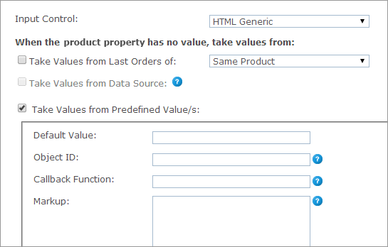
Once the HTML control is selected, you can set each product’s product property values in the When the product property has no value, take values from section. The product property values can be one of the following:
Take Values from Last Orders
of
This option is relevant for the default value selection only. To display values used in the previous orders, select this checkbox and then select one of the following options:
-
Same Product: The value this customer gave this dial in the previous order of this product.
-
All Products in the Store: The value this customer gave this dial in the previous order of any other product. However, if there was already an order from this product, it will take its value. (Note that all products need to be from the same document in the same campaign.)
Take Values from Predefined Value(s)
-
Default Value: the Dial’s default value, which may be overridden by the customer.
-
Object ID: in case you are embedding a Flash object, fill in its Client’s ID.
-
Callback Function: you can define a Java Script Callback Function in the Callback Function field, which will be available on the page, and call it to return a value to uStore.
-
Markup: you can use the following parameters in the markup code:
-
#DIAL_VALUE#: will be replaced with the value of the dial as saved in the database.
-
#DIAL_DISPLAY_NAME#: will be replaced with the name of the dial as set in Display Name field.
-
Tip: If you wish to add the user's group name into the Generic HTML property, call:
UStoreProvider.state.get().currentUser.Groups
Dropdown list and radio button list
The Dropdown List input control enables the customer to choose a value from a list of predefined options. This input control displays the choice list to the user as a standard dropdown control. In addition to defining the format of the selection and the values displayed, you can also define a JDF node for each value.
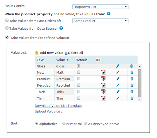
Radio Button List is similar to the dropdown list input control but displays the choice list to the user as a set of standard radio-style inputs.
Similarly to the Dropdown list, when you select Radio Button List, you can also define the JDF node for each value.
Once the radio button or dropdown List controls are selected, you can set each product’s product property values in the When the product property has no value, take values from section. The product property values can be one of the following:
Take values from Last Orders of
This option is relevant for the default value selection only. To display values used in the previous orders, select this checkbox and then select one of the following options:
-
Same Product: The value this customer gave this dial in the previous order of this product.
-
All Products in the Store: The value this customer gave this dial in the previous order of any other product. However, if there was already an order from this product, it will take its value. (Note that all products need to be from the same document in the same campaign.)
Take Values from Data Source (not available for StoreFlow Cloud
customers)
This option allows you to retrieve a value for single option controls, such as text boxes, and options and selected values for multiple option controls, such as dropdown lists, from a database, rather than defining them manually.
For example, you can define an input control of type dropdown list that is populated with the customers’ addresses as registered in the uStore database instead of manually defining each entry of the list. This way, you can present each store shopper a personalized list. You can use the predefined uStore databases or you can define a custom database that conforms to the uStore database structure.
Note that you can only use either a global data source (available for all stores) or a data source that was defined for the specific store you are configuring. For more information on how to define a data source, refer to Defining Data Sources.
The Override existing value option instructs uStore to override the existing value of a control, set by the shopper in the storefront, to always reflect the latest database value. This can occur in any page in the store where the property/dial appears, e.g. customization step, finalize step.
Also, when reordering, before the order is placed in the cart, uStore will retrieve the most up-to-date dial/property value from the database.
If left unselected, the value will be retrieved only once, when the dial/property does not have a value.
After you select a data source from the data source list available for the store, use the Wizard option to populate personalized values from the data source, or set the personalized values manually by entering an SQL query in the Custom option.
Wizard
Provide the following information:
-
Table or View: select the table or view from which data is pulled.
-
Display Text Field (Multiple Options Input Controls): the text that is displayed in the input control and is associated with a Value field. For example, the presented text may be an address while the associated value field that is passed on to uProduce is a ZIP code. This selection is available only in multiple input controls.
-
Value Field: select the field (column) in the table or view that will be used to populate the input control. For example, you may have a field in your table or view that stores a recipient names; select that field to populate the input control with names from the Recipient column.
-
Conditions: The wizard enables you to define filters by which the specific value in the Value Field is pulled. You can use the following ID filters:
-
User ID Field - available in the Users table
-
External User ID Field - available in the External Users table
-
User Email Field- available in the User Email table
-
Store ID Field - available in the Stores table
-
Product ID Field - available in the Products table
-
Language ID Field - available in the Culture table
You can also use any desired ID filters provided they are mapped to the above uStore ID filters. If you are defining a single option input control and the filter you are defining returns several records, only the first one will be displayed to the user.
-
Filter (for Dependent Dropdown List only): A column in the database ("Display Text Field") is filtered according to certain criteria. There are three criteria:
Fixed: the column data is filtered by a fixed value. For example, the wine list can be filtered by its color.
Dial: the column data is filtered by the dial selected in the previous dropdown list. Both dials should be of the Dependent Dropdown List type (Dial settings only).
Property: the column data is filtered by the property selected in the previous dropdown list. Both dials should be of the Dependent Dropdown List type (Property settings only).
-
-
Default Field (multiple options input Controls): select the field (column) in the table or view that will be used to set the default value of the input control. Then, enter the specific value in that field that actually sets the default value. For example, the default value field can be 'IsDefault' and the actual values that set the default value can be '1' for 'is default' and '0' for 'not default'. In this case, you should select 'IsDefault' in the Default Field list and enter '1' as its value.
-
Override Default Sorting Field (Multiple Options Input Controls): allows you to sort the input control entries by the order in a specified table field (or view). The sorting order is determined by the data type in the selected field, as follows:
-
lexicographic order for text
-
alphanumeric order for numbers
-
chronological order for dates
-
-
Hide when there are no options to select (for Dependent Dropdown List only): the second dropdown list will appear only if there are values to select.
For example, if you choose USA from the Country dropdown list, the State dropdown list will appear; but if you choose England from the Country list, the State list will not be shown.
For this option to work, the data for the first dropdown list and the data for the second dropdown list must be in separate tables. For example, you should have one table for the list of countries that contains a field for CountryID and another field for CountryName. You will then need a separate table for the list of states with a field for StateID, Country and Name.
Custom
To manually define the Data Source for personalized values, select Custom and enter an SQL query in the Query field.
-
If you are using a single option Input Control such as a Text Box, you should enter a query that returns a single value. You should use one or more of the following parameters: @UserID, @StoreID, @ProductID, @CultureID, @OrderProductID (which is @OrderItemID), @ExternalUserID, @UserEmail.
-
If you are using a multiple options input control such as a Dropdown list, you should enter a query that can return several values. You should use one or more of the following parameters: @UserID, @StoreID, @ProductID, @CultureID, @OrderProductID (which is @OrderItemID), @ExternalUserID, @UserEmail.
Take values from Predefined
Value(s)
To set the predefined values for the Radio Button List and the Dropdown List input controls:
-
Click the Add new value link and enter a value and a value text to be presented in the selected control in the Value and Text fields respectively.
The text is displayed to the customer and the value is sent to uProduce as the product value.
-
To add a JDF node to the value, in the JDF node set list, select the equivalent option.
The list of JDF nodes displays the nodes set in Presets > System Setup > JDF Node Set. For more information, see Setting Up JDF Nodes.
-
Click the checkmark to add the value to the Value List.
-
Repeat this step to add more values to the Value List.
-
After you add all the required values, to set the default value, select the checkbox in the Default column.
-
To edit a value in the Value List, click the icon next to the value you want to edit.
-
You can sort the drop-down list values alphabetically (select Alphabetical), numerically (select Numerical) or chronologically according to the date and time in which the list values were created (select Creation Time).
-
You can also download a template of a Value List Excel Spreadsheet (click the Download Value List Template link) and upload it again once it is fully prepared (click the Upload Value List link). The Value List will be automatically populated with the values you defined in the Excel Spreadsheet.
You will be notified if errors exist in your spreadsheet. For example:
-
If an existing value in the Value List has been defined in the spreadsheet.
-
If an existing value text in the Value List has been defined in the spreadsheet.
-
If the Value List Template is missing a value or a value display text.
-
If the Value List Template includes duplicates of values or values’ text.
-
You can select both the Take Values from Data Source and the Take values from Predefined Value(s) options. In that case, if a value is missing in the Data Source, it will be taken from the values set in the predefined list.
Get order properties
The Get Order Properties input control enables you to add the Order ID or the Order Item ID values, which are generated automatically, to your product. This way, an order or an order item can be easily distinguished with an ID number.
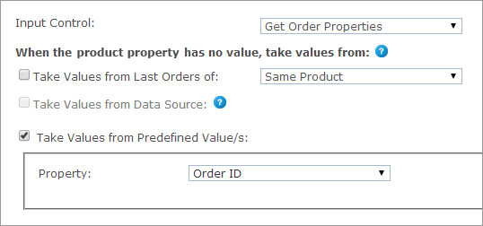
When the Get Order Properties control is selected, you can set each product’s product property values in the When the product property has no value, take values from section. The product property values can be one of the following:
Take values from Last Orders of
This option is relevant for the default value selection only. To display values used in the previous orders, select this checkbox and then select one of the following options:
-
Same Product: The value this customer gave this product in the previous order of this product.
-
All Products in the Store: The value this customer gave this product in the previous order of any other product. However, if there was already an order from this product, it will take its value. (Note that all products need to be from the same document in the same campaign.)
Take values from Predefined Value(s)
-
Property: select Order ID or Order Item ID.
Checkbox
The Checkbox input control enables you to add a checkbox as a product property.
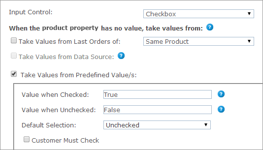
When the Checkbox control is selected, you can set each product’s product property values in the When the product property has no value, take values from section. The product property values can be one of the following:
Take values from Last Orders of
This option is relevant for the default value selection only. To display values used in the previous orders, select this checkbox and then select one of the following options:
-
Same Product: the value this customer gave this product in the previous order of this product.
-
All Products in the Store: the value this customer gave this product in the previous order of any other product. However, if there was already an order from this product, it will take its value. (Note that all products need to be from the same document in the same campaign.)
Take values from Predefined Value(s)
-
Value when Checked: set the value that the property is given when that checkbox is selected.
-
Value when Unchecked: set the value that the property is given when that checkbox is cleared.
-
Default Selection: select Checked or Unchecked.
-
Customer Must Check: you can define the checkbox input control as mandatory by selecting the Customer Must Check checkbox. This way, customers will not be able to continue shopping unless this checkbox is selected. For example, you can add a EULA statement as a product property and ask customers to accept it in order to continue the shopping process.
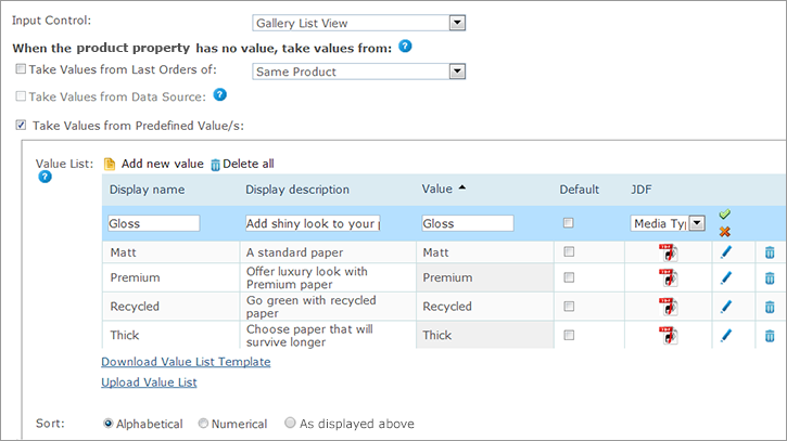
Gallery list/grid view
The Gallery List/Grid View input control enables the customer to choose a value from predefined options. The options are displayed as a list/grid of icons, with names and descriptions.
Similarly to the Dropdown and the Radio Button lists, when you select Gallery List/Grid List, you can also define the JDF node for each value.
Each property option of a gallery control may include the following icons.
-
Property option’s icon: Displayed near the description.
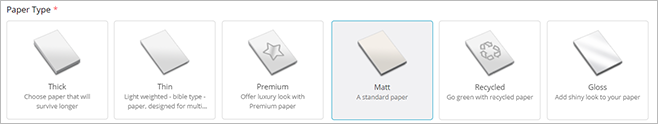
-
Property option overlay image: A graphic display of the property that overlays the document thumbnail for a more reliable product preview.
To upload icons, go to the Property Options Icon Management window.
To set the predefined values for the gallery list/grid view input control:
-
Click the Add new value link and enter a value and a display name to be presented in the selected control in the Value and Display name fields respectively.
The name is displayed to the customer and the value is sent to uProduce as the product value.
-
To add a JDF node to the value, in the JDF node set list select the equivalent option.
The list of JDF nodes includes the nodes set in Presets > System Setup > JDF Node Set. For more information, see Setting Up JDF Nodes.
-
Click
 to add the value to the list.
 -
Repeat steps 1 - 3 to add more values to the Value List.
-
After you add all the required values, you can set one of the values as the default value by selecting the required checkbox in the Default column.
-
To edit a value in the Value List, click the Edit
 icon next to the value you want to edit.
 -
In the Sort field, you can define how the list of values will be sorted in the storefront: alphabetically (select Alphabetical), numerically (select Numerical) or chronologically (select As displayed above) according to the time they were created.
-
You can download a Value List Excel template by clicking the Download Value List Template link. Once it is fully prepared you can upload it again by clicking the Upload Value List link.
The Value List will be automatically populated with the values you defined in the Excel spreadsheet.You will be notified if errors exist in your spreadsheet. For example:
-
If an existing value in the Value List has been defined in the spreadsheet.
-
If an existing value text in the Value List has been defined in the spreadsheet.
-
If the Value List template is missing a value or a value display text.
-
If the Value List Template includes duplicates of values or values’ text.
-
Gallery image selector
The Gallery Image Selector input control offers customers editing capabilities, such as rotate, crop or flip the image.
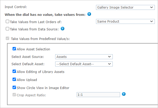
Once the Gallery Image Selector control is selected, you can set each product’s dial values in the When the dial has no value, take values from section. The dial values can be one of the following:
Take values from Last Orders of
This option is relevant for the default value selection only. To display values used in the previous orders, select this checkbox and then select one of the following options:
-
Same Product: The value this customer gave this dial in the previous order of this product.
-
All Products in the Store: The value this customer gave this dial in the previous order of any other product. However, if there was already an order from this product, it will take its value. (Note that all products need to be from the same document in the same campaign.)
Take values from Data Source (not available for StoreFlow Cloud customers)
This option allows you to retrieve a value for single option controls, such as text boxes, and options and selected values for multiple option controls, such as dropdown lists, from a database, rather than defining them manually.
For example, you can define an input control of type dropdown list that is populated with the customers’ addresses as registered in the uStore database instead of manually defining each entry of the list. This way, you can present each store shopper a personalized list. You can use the predefined uStore databases or you can define a custom database that conforms to the uStore database structure.
Note that you can only use either a global data source (available for all stores) or a data source that was defined for the specific store you are configuring. For more information on how to define a data source, refer to Defining Data Sources.
The Override existing value option instructs uStore to override the existing value of a control, set by the shopper in the storefront, to always reflect the latest database value. This can occur in any page in the store where the property/dial appears, e.g. customization step, finalize step.
Also, when reordering, before the order is placed in the cart, uStore will retrieve the most up-to-date dial/property value from the database.
If left unselected, the value will be retrieved only once, when the dial/property does not have a value.
After you select a data source from the data source list available for the store, use the Wizard option to populate personalized values from the data source, or set the personalized values manually by entering an SQL query in the Custom option.
Wizard
Provide the following information:
-
Table or View: select the table or view from which data is pulled.
-
Display Text Field (Multiple Options Input Controls): the text that is displayed in the input control and is associated with a Value field. For example, the presented text may be an address while the associated value field that is passed on to uProduce is a ZIP code. This selection is available only in multiple input controls.
-
Value Field: select the field (column) in the table or view that will be used to populate the input control. For example, you may have a field in your table or view that stores a recipient names; select that field to populate the input control with names from the Recipient column.
-
Conditions: The wizard enables you to define filters by which the specific value in the Value Field is pulled. You can use the following ID filters:
-
User ID Field - available in the Users table
-
External User ID Field - available in the External Users table
-
User Email Field- available in the User Email table
-
Store ID Field - available in the Stores table
-
Product ID Field - available in the Products table
-
Language ID Field - available in the Culture table
You can also use any desired ID filters provided they are mapped to the above uStore ID filters. If you are defining a single option input control and the filter you are defining returns several records, only the first one will be displayed to the user.
-
Filter (for Dependent Dropdown List only): A column in the database ("Display Text Field") is filtered according to certain criteria. There are three criteria:
Fixed: the column data is filtered by a fixed value. For example, the wine list can be filtered by its color.
Dial: the column data is filtered by the dial selected in the previous dropdown list. Both dials should be of the Dependent Dropdown List type (Dial settings only).
Property: the column data is filtered by the property selected in the previous dropdown list. Both dials should be of the Dependent Dropdown List type (Property settings only).
-
-
Default Field (multiple options input Controls): select the field (column) in the table or view that will be used to set the default value of the input control. Then, enter the specific value in that field that actually sets the default value. For example, the default value field can be 'IsDefault' and the actual values that set the default value can be '1' for 'is default' and '0' for 'not default'. In this case, you should select 'IsDefault' in the Default Field list and enter '1' as its value.
-
Override Default Sorting Field (Multiple Options Input Controls): allows you to sort the input control entries by the order in a specified table field (or view). The sorting order is determined by the data type in the selected field, as follows:
-
lexicographic order for text
-
alphanumeric order for numbers
-
chronological order for dates
-
-
Hide when there are no options to select (for Dependent Dropdown List only): the second dropdown list will appear only if there are values to select.
For example, if you choose USA from the Country dropdown list, the State dropdown list will appear; but if you choose England from the Country list, the State list will not be shown.
For this option to work, the data for the first dropdown list and the data for the second dropdown list must be in separate tables. For example, you should have one table for the list of countries that contains a field for CountryID and another field for CountryName. You will then need a separate table for the list of states with a field for StateID, Country and Name.
Custom
To manually define the Data Source for personalized values, select Custom and enter an SQL query in the Query field.
-
If you are using a single option Input Control such as a Text Box, you should enter a query that returns a single value. You should use one or more of the following parameters: @UserID, @StoreID, @ProductID, @CultureID, @OrderProductID (which is @OrderItemID), @ExternalUserID, @UserEmail.
-
If you are using a multiple options input control such as a Dropdown list, you should enter a query that can return several values. You should use one or more of the following parameters: @UserID, @StoreID, @ProductID, @CultureID, @OrderProductID (which is @OrderItemID), @ExternalUserID, @UserEmail.
Take Values from Predefined Value(s)
-
Allow Asset Selection: enables customers to choose images from the available Campaign Assets on the uProduce Server.
-
Select Asset Source: choose the Asset Source folder on the uProduce Server, from which the images will be chosen for this Dial. The Asset Source in uProduce is completely synchronized with uStore: if the Asset Source is modified in uProduce, this change will be automatically updated in uStore.
-
Select Default Asset: from the above asset source, choose the image to be displayed as the default picture.
-
Allow Editing of Library Assets: This option gives the customer the ability to edit an image from the image library. Editing options include scaling, cropping, etc.
-
-
Allow Upload: enables customers to upload their own pictures and use them in the document.
If you do not need to keep the history of uploaded images, select Hide Gallery. -
Show Circular Overlay in Editor: use this option if the image in the product is circular. A circular guide will appear in the image editor, helping the shopper fit the image into the circle.
The cropping aspect ratio will be set to 1:1. -
Crop Aspect Ratio: specify the crop ratio (Width:Height) for the uploaded images. This field is displayed only if the Allow Upload checkbox is checked.
In the Storefront Application, the customer will be able to enter the Edit Mode for the uploaded images and perform Crop and Enhance operations. The crop ratio will be as defined in the Crop Aspect Ratio field in the back office.
You can select both the Take Values from Data Source and the Take values from Predefined Value(s) options. In that case, if a value is missing in the data source, it will be taken from the values set in the predefined list.
The Gallery Image Selector allows the customer to select existing images (Allow Asset Selection), or upload images from the computer (Allow Image Upload). The image selector allows to upload files up to the size of 5 MB.
The Gallery Image Selector input control offers customers editing capabilities (Allow Editing Uploaded/Asset Images), such as rotate, crop and maintain aspect ratio, or flip the image.
You can configure the opening of the image editor: automatically with the upload or selection of an image, manually by the user, or if the selected image is invalid.
Permitted formats for upload:
-
INDD products: JPG, JPEG, PDF, TIFF, TIF, PNG, GIF, BMP
-
XLIM products: JPG, JPEG, PDF, TIFF, TIF
Note: EPS, EPSF and PSD assets are supported in dynamic products in multi-page flow, but are not supported in the new image library used in single page flow.
(Popup) Image selector
The Image Selector and the Popup Image Selector enable customers to choose images from the available campaign assets on the uProduce Server or to upload their own pictures and use them in the document. When these controls are selected, store administrators can restrict the width, height and ratio ranges of the uploaded graphic file to predefined measures. The Image Selector shows all the images on the page, whereas the Popup Image Selector shows only the selected image on the page together with a button that can be used to pop up a window with all other images, from which customers can choose.
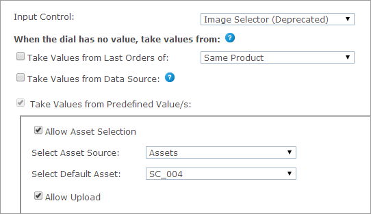
Once the (Popup) Image control is selected, you can set each product’s dial values in the When the dial has no value, take values from section. The dial values can be one of the following:
Take values from Last Orders of
This option is relevant for the default value selection only. To display values used in the previous orders, select this checkbox and then select one of the following options:
-
Same Product: The value this customer gave this dial in the previous order of this product.
-
All Products in the Store: The value this customer gave this dial in the previous order of any other product. However, if there was already an order from this product, it will take its value. (Note that all products need to be from the same document in the same campaign.)
Take values from Data Source (not available for StoreFlow Cloud customers)
This option allows you to retrieve a value for single option controls, such as text boxes, and options and selected values for multiple option controls, such as dropdown lists, from a database, rather than defining them manually.
For example, you can define an input control of type dropdown list that is populated with the customers’ addresses as registered in the uStore database instead of manually defining each entry of the list. This way, you can present each store shopper a personalized list. You can use the predefined uStore databases or you can define a custom database that conforms to the uStore database structure.
Note that you can only use either a global data source (available for all stores) or a data source that was defined for the specific store you are configuring. For more information on how to define a data source, refer to Defining Data Sources.
The Override existing value option instructs uStore to override the existing value of a control, set by the shopper in the storefront, to always reflect the latest database value. This can occur in any page in the store where the property/dial appears, e.g. customization step, finalize step.
Also, when reordering, before the order is placed in the cart, uStore will retrieve the most up-to-date dial/property value from the database.
If left unselected, the value will be retrieved only once, when the dial/property does not have a value.
After you select a data source from the data source list available for the store, use the Wizard option to populate personalized values from the data source, or set the personalized values manually by entering an SQL query in the Custom option.
Wizard
Provide the following information:
-
Table or View: select the table or view from which data is pulled.
-
Display Text Field (Multiple Options Input Controls): the text that is displayed in the input control and is associated with a Value field. For example, the presented text may be an address while the associated value field that is passed on to uProduce is a ZIP code. This selection is available only in multiple input controls.
-
Value Field: select the field (column) in the table or view that will be used to populate the input control. For example, you may have a field in your table or view that stores a recipient names; select that field to populate the input control with names from the Recipient column.
-
Conditions: The wizard enables you to define filters by which the specific value in the Value Field is pulled. You can use the following ID filters:
-
User ID Field - available in the Users table
-
External User ID Field - available in the External Users table
-
User Email Field- available in the User Email table
-
Store ID Field - available in the Stores table
-
Product ID Field - available in the Products table
-
Language ID Field - available in the Culture table
You can also use any desired ID filters provided they are mapped to the above uStore ID filters. If you are defining a single option input control and the filter you are defining returns several records, only the first one will be displayed to the user.
-
Filter (for Dependent Dropdown List only): A column in the database ("Display Text Field") is filtered according to certain criteria. There are three criteria:
Fixed: the column data is filtered by a fixed value. For example, the wine list can be filtered by its color.
Dial: the column data is filtered by the dial selected in the previous dropdown list. Both dials should be of the Dependent Dropdown List type (Dial settings only).
Property: the column data is filtered by the property selected in the previous dropdown list. Both dials should be of the Dependent Dropdown List type (Property settings only).
-
-
Default Field (multiple options input Controls): select the field (column) in the table or view that will be used to set the default value of the input control. Then, enter the specific value in that field that actually sets the default value. For example, the default value field can be 'IsDefault' and the actual values that set the default value can be '1' for 'is default' and '0' for 'not default'. In this case, you should select 'IsDefault' in the Default Field list and enter '1' as its value.
-
Override Default Sorting Field (Multiple Options Input Controls): allows you to sort the input control entries by the order in a specified table field (or view). The sorting order is determined by the data type in the selected field, as follows:
-
lexicographic order for text
-
alphanumeric order for numbers
-
chronological order for dates
-
-
Hide when there are no options to select (for Dependent Dropdown List only): the second dropdown list will appear only if there are values to select.
For example, if you choose USA from the Country dropdown list, the State dropdown list will appear; but if you choose England from the Country list, the State list will not be shown.
For this option to work, the data for the first dropdown list and the data for the second dropdown list must be in separate tables. For example, you should have one table for the list of countries that contains a field for CountryID and another field for CountryName. You will then need a separate table for the list of states with a field for StateID, Country and Name.
Custom
To manually define the Data Source for personalized values, select Custom and enter an SQL query in the Query field.
-
If you are using a single option Input Control such as a Text Box, you should enter a query that returns a single value. You should use one or more of the following parameters: @UserID, @StoreID, @ProductID, @CultureID, @OrderProductID (which is @OrderItemID), @ExternalUserID, @UserEmail.
-
If you are using a multiple options input control such as a Dropdown list, you should enter a query that can return several values. You should use one or more of the following parameters: @UserID, @StoreID, @ProductID, @CultureID, @OrderProductID (which is @OrderItemID), @ExternalUserID, @UserEmail.
Take values from Predefined Value(s)
-
Allow Asset Selection: enables customers to choose images from the available Campaign Asset folders on the uProduce Server.
-
Select Asset Source: choose the Asset Source folder on the uProduce Server, from which the images will be chosen for this Dial. The Asset Source in uProduce is completely synchronized with uStore: if the Asset Source is modified in uProduce, this change will be automatically updated in uStore.
-
Select Default Asset: from the above asset source, choose the image to be displayed as the default picture.
-
Allow Upload: enables customers to upload their own pictures and use them in the document.
You can select both the Take Values from Data Source and the Take values from Predefined Value(s) options. In that case, if a value is missing in the Data Source, it will be taken from the values set in the predefined list.
uStore storefront displays a thumbnail image for the following image types: *.jpg, *.bmp, *.png and *.gif. Images of unsupported file types can be previewed in the customer’s default imaging software by clicking the Click to Preview link.
Extended image popup selector (deprecated)
In addition to capabilities offered by the Image Selector and the Popup Image Selector (such as, selecting or uploading images), the Extended Image Popup Selector input control enables customers to crop the uploaded images.
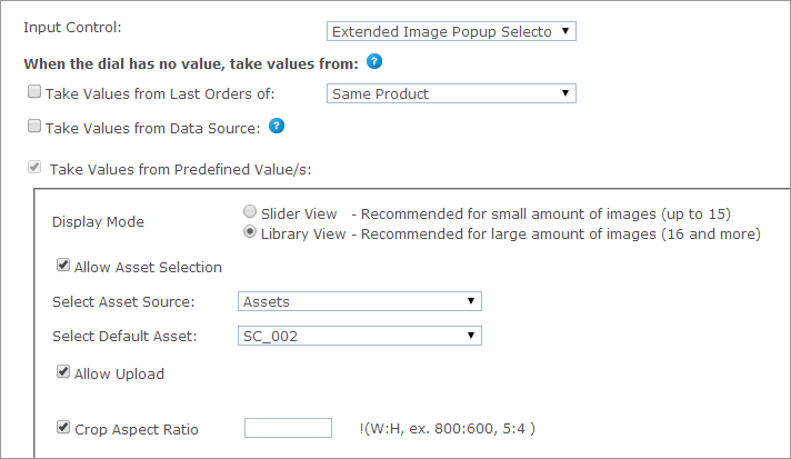
Once the Extended Image Popup control is selected, you can set each product’s dial values in the When the dial has no value, take values from section. The dial values can be one of the following:
Take values from Last Orders of
This option is relevant for the default value selection only. To display values used in the previous orders, select this checkbox and then select one of the following options:
-
Same Product: The value this customer gave this dial in the previous order of this product.
-
All Products in the Store: The value this customer gave this dial in the previous order of any other product. However, if there was already an order from this product, it will take its value. (Note that all products need to be from the same document in the same campaign.)
Take values from Data Source (not available for StoreFlow Cloud customers)
This option allows you to retrieve a value for single option controls, such as text boxes, and options and selected values for multiple option controls, such as dropdown lists, from a database, rather than defining them manually.
For example, you can define an input control of type dropdown list that is populated with the customers’ addresses as registered in the uStore database instead of manually defining each entry of the list. This way, you can present each store shopper a personalized list. You can use the predefined uStore databases or you can define a custom database that conforms to the uStore database structure.
Note that you can only use either a global data source (available for all stores) or a data source that was defined for the specific store you are configuring. For more information on how to define a data source, refer to Defining Data Sources.
The Override existing value option instructs uStore to override the existing value of a control, set by the shopper in the storefront, to always reflect the latest database value. This can occur in any page in the store where the property/dial appears, e.g. customization step, finalize step.
Also, when reordering, before the order is placed in the cart, uStore will retrieve the most up-to-date dial/property value from the database.
If left unselected, the value will be retrieved only once, when the dial/property does not have a value.
After you select a data source from the data source list available for the store, use the Wizard option to populate personalized values from the data source, or set the personalized values manually by entering an SQL query in the Custom option.
Wizard
Provide the following information:
-
Table or View: select the table or view from which data is pulled.
-
Display Text Field (Multiple Options Input Controls): the text that is displayed in the input control and is associated with a Value field. For example, the presented text may be an address while the associated value field that is passed on to uProduce is a ZIP code. This selection is available only in multiple input controls.
-
Value Field: select the field (column) in the table or view that will be used to populate the input control. For example, you may have a field in your table or view that stores a recipient names; select that field to populate the input control with names from the Recipient column.
-
Conditions: The wizard enables you to define filters by which the specific value in the Value Field is pulled. You can use the following ID filters:
-
User ID Field - available in the Users table
-
External User ID Field - available in the External Users table
-
User Email Field- available in the User Email table
-
Store ID Field - available in the Stores table
-
Product ID Field - available in the Products table
-
Language ID Field - available in the Culture table
You can also use any desired ID filters provided they are mapped to the above uStore ID filters. If you are defining a single option input control and the filter you are defining returns several records, only the first one will be displayed to the user.
-
Filter (for Dependent Dropdown List only): A column in the database ("Display Text Field") is filtered according to certain criteria. There are three criteria:
Fixed: the column data is filtered by a fixed value. For example, the wine list can be filtered by its color.
Dial: the column data is filtered by the dial selected in the previous dropdown list. Both dials should be of the Dependent Dropdown List type (Dial settings only).
Property: the column data is filtered by the property selected in the previous dropdown list. Both dials should be of the Dependent Dropdown List type (Property settings only).
-
-
Default Field (multiple options input Controls): select the field (column) in the table or view that will be used to set the default value of the input control. Then, enter the specific value in that field that actually sets the default value. For example, the default value field can be 'IsDefault' and the actual values that set the default value can be '1' for 'is default' and '0' for 'not default'. In this case, you should select 'IsDefault' in the Default Field list and enter '1' as its value.
-
Override Default Sorting Field (Multiple Options Input Controls): allows you to sort the input control entries by the order in a specified table field (or view). The sorting order is determined by the data type in the selected field, as follows:
-
lexicographic order for text
-
alphanumeric order for numbers
-
chronological order for dates
-
-
Hide when there are no options to select (for Dependent Dropdown List only): the second dropdown list will appear only if there are values to select.
For example, if you choose USA from the Country dropdown list, the State dropdown list will appear; but if you choose England from the Country list, the State list will not be shown.
For this option to work, the data for the first dropdown list and the data for the second dropdown list must be in separate tables. For example, you should have one table for the list of countries that contains a field for CountryID and another field for CountryName. You will then need a separate table for the list of states with a field for StateID, Country and Name.
Custom
To manually define the Data Source for personalized values, select Custom and enter an SQL query in the Query field.
-
If you are using a single option Input Control such as a Text Box, you should enter a query that returns a single value. You should use one or more of the following parameters: @UserID, @StoreID, @ProductID, @CultureID, @OrderProductID (which is @OrderItemID), @ExternalUserID, @UserEmail.
-
If you are using a multiple options input control such as a Dropdown list, you should enter a query that can return several values. You should use one or more of the following parameters: @UserID, @StoreID, @ProductID, @CultureID, @OrderProductID (which is @OrderItemID), @ExternalUserID, @UserEmail.
Take values from Predefined Value(s)
-
Display Mode: the store administrator can select one of the two available display modes: Slider View (for less than 16 images) and Library (grid) View (for more than 16 images).
-
Allow Asset Selection: enables customers to choose images from the available Campaign Assets on the uProduce Server.
-
Select Asset Source: choose the Asset Source folder on the uProduce Server, from which the images will be chosen for this Dial. The Asset Source in uProduce is completely synchronized with uStore: if the Asset Source is modified in uProduce, this change will be automatically updated in uStore.
-
Select Default Asset: from the above asset source, choose the image to be displayed as the default picture.
-
-
Allow Upload: enables customers to upload their own pictures and use them in the document.
-
Crop Aspect Ratio: specify the crop ratio (Width:Height) for the uploaded images. This field is displayed only if the Allow Upload checkbox is checked.
In the Storefront Application, the customer will be able to enter the Edit Mode for the uploaded images and perform Crop and Enhance operations. The crop ratio will be as defined in the Crop Aspect Ratio field in the Back Office.
When clicking Enhance, the customer will be offered several enhancing options with a preview and a possibility to compare the uploaded image with the enhanced one.
You can select both the Take Values from Data Source and the Take values from Predefined Value(s) options. In that case, if a value is missing in the Data Source, it will be taken from the values set in the predefined list.
The Extended Image Selector is displayed in storefront in one of the following views: Library view or Slider View.
Dependent dropdown list
This feature enables you to create two types of dependent dropdown lists:
-
A dropdown list that displays choices that depend on the value selected in a previous dropdown list.
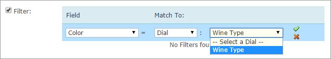
In the following example, the value selected in the Wine Type list affect the values displayed in the Wine Name list. If the user chooses Red under Wine Type, the wine names will be filtered display red wines only.
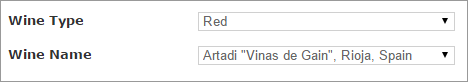
-
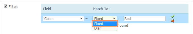
A list that displays values filtered according to a fixed criterion. For example, the following list is filtered to display red wines only.

This topic explains how to create dependency dials. It is also possible to create this dependency for properties.
Example of filtering by a dial
The settings for dependent dropdown lists are similar to those of regular dropdown Lists, however the dependent dropdown list includes an additional option of filtering.
This following procedure explains how to define a dependent dial filter using the Wine Type and Wine Name example.
-
In the Dial Details page, in the Display Name text box, enter Wine Type.
-
From the Input Control list, select Dependent Dropdown List.
-
Select the following checkbox:
Take values from Data Source checkbox (not available for StoreFlow Cloud customers).
This option allows you to retrieve a value for single option controls, such as text boxes, and options and selected values for multiple option controls, such as dropdown lists, from a database, rather than defining them manually.
For example, you can define an input control of type dropdown list that is populated with the customers’ addresses as registered in the uStore database instead of manually defining each entry of the list. This way, you can present each store shopper a personalized list. You can use the predefined uStore databases or you can define a custom database that conforms to the uStore database structure.
Note that you can only use either a global data source (available for all stores) or a data source that was defined for the specific store you are configuring. For more information on how to define a data source, refer to Defining Data Sources.
The Override existing value option instructs uStore to override the existing value of a control, set by the shopper in the storefront, to always reflect the latest database value. This can occur in any page in the store where the property/dial appears, e.g. customization step, finalize step.
Also, when reordering, before the order is placed in the cart, uStore will retrieve the most up-to-date dial/property value from the database.
If left unselected, the value will be retrieved only once, when the dial/property does not have a value.
After you select a data source from the data source list available for the store, use the Wizard option to populate personalized values from the data source, or set the personalized values manually by entering an SQL query in the Custom option.
Wizard
Provide the following information:
-
Table or View: select the table or view from which data is pulled.
-
Display Text Field (Multiple Options Input Controls): the text that is displayed in the input control and is associated with a Value field. For example, the presented text may be an address while the associated value field that is passed on to uProduce is a ZIP code. This selection is available only in multiple input controls.
-
Value Field: select the field (column) in the table or view that will be used to populate the input control. For example, you may have a field in your table or view that stores a recipient names; select that field to populate the input control with names from the Recipient column.
-
Conditions: The wizard enables you to define filters by which the specific value in the Value Field is pulled. You can use the following ID filters:
-
User ID Field - available in the Users table
-
External User ID Field - available in the External Users table
-
User Email Field- available in the User Email table
-
Store ID Field - available in the Stores table
-
Product ID Field - available in the Products table
-
Language ID Field - available in the Culture table
You can also use any desired ID filters provided they are mapped to the above uStore ID filters. If you are defining a single option input control and the filter you are defining returns several records, only the first one will be displayed to the user.
-
Filter (for Dependent Dropdown List only): A column in the database ("Display Text Field") is filtered according to certain criteria. There are three criteria:
Fixed: the column data is filtered by a fixed value. For example, the wine list can be filtered by its color.
Dial: the column data is filtered by the dial selected in the previous dropdown list. Both dials should be of the Dependent Dropdown List type (Dial settings only).
Property: the column data is filtered by the property selected in the previous dropdown list. Both dials should be of the Dependent Dropdown List type (Property settings only).
-
-
Default Field (multiple options input Controls): select the field (column) in the table or view that will be used to set the default value of the input control. Then, enter the specific value in that field that actually sets the default value. For example, the default value field can be 'IsDefault' and the actual values that set the default value can be '1' for 'is default' and '0' for 'not default'. In this case, you should select 'IsDefault' in the Default Field list and enter '1' as its value.
-
Override Default Sorting Field (Multiple Options Input Controls): allows you to sort the input control entries by the order in a specified table field (or view). The sorting order is determined by the data type in the selected field, as follows:
-
lexicographic order for text
-
alphanumeric order for numbers
-
chronological order for dates
-
-
Hide when there are no options to select (for Dependent Dropdown List only): the second dropdown list will appear only if there are values to select.
For example, if you choose USA from the Country dropdown list, the State dropdown list will appear; but if you choose England from the Country list, the State list will not be shown.
For this option to work, the data for the first dropdown list and the data for the second dropdown list must be in separate tables. For example, you should have one table for the list of countries that contains a field for CountryID and another field for CountryName. You will then need a separate table for the list of states with a field for StateID, Country and Name.
Custom
To manually define the Data Source for personalized values, select Custom and enter an SQL query in the Query field.
-
If you are using a single option Input Control such as a Text Box, you should enter a query that returns a single value. You should use one or more of the following parameters: @UserID, @StoreID, @ProductID, @CultureID, @OrderProductID (which is @OrderItemID), @ExternalUserID, @UserEmail.
-
If you are using a multiple options input control such as a Dropdown list, you should enter a query that can return several values. You should use one or more of the following parameters: @UserID, @StoreID, @ProductID, @CultureID, @OrderProductID (which is @OrderItemID), @ExternalUserID, @UserEmail.
-
-
Enter data as follows:
-
For Table or View, select the required table.
-
For Display Text Field, select the value displayed to the viewer. For example, Color.
-
For Value Field, select the returned value.
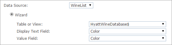
-
-
Repeat steps 1-3 for the second dropdown list, Wine Name, and select settings as follows:
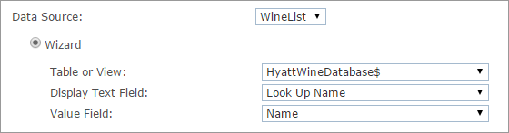
Both Wine Type and Wine Name need to be defined as dependent dropdown lists.
-
Select the Filter checkbox, and define a filter by which the Wine Name list will display values that depend on the value selected in the Wine Type list.
Example of filtering by a fixed value
Let's say you want to create two separate dropdown lists, one for Red Wine and one for White Wine.
You can define a filter to filter each list by a fixed value. This means that the first list will display red wine names only, and the second will display white wine names only.
File attachment
The File Attachment input control enables the customer to upload files as part of the product properties. Uploaded files can be of several types, such as PDF, PPT,PPTX, DOC, DOCX, EPS, EPSF, JPG, JPEG, and can be defined by the customer’s personal needs. You can allow customers to upload files from the local drive or from external document repositories (StoreFlow Shared Cloud customers can only upload from the local drive).
After the customer uploads the files, the files become available for download in the backoffice in the Item Details page.
Note: You can determine the default file types. For further information, see FileAttachmentDefaultExtensions in the Global Configurations Table.
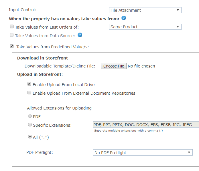
The product property value can be one of the following:
Take values from Last Orders of
This option is relevant for the default value selection only. To display values used in the previous orders, select this checkbox and then select one of the following options:
-
Same Product: The value this customer gave this dial in the previous order of this product.
-
All Products in the Store: The value this customer gave this dial in the previous order of any other product. However, if there was already an order from this product, it will take its value. (Note that all products need to be from the same document in the same campaign.)
Take values from Predefined Value(s)
Download in Storefront
-
Download Template/Dieline File: Optional. Select the template or dieline file which you wish the customer to download, edit, and then upload to the store.
Upload in Storefront
You can enable upload from both the local drive and external repositories.

-
Enable Upload From Local Drive: Select this checkbox if you wish to enable customers to upload files from their local drives.
-
Enable Upload From External Document Repositories: (not available for SaaS customers) Select this option to allow customers to upload files from external document repositories, and then select the required external source.
To learn how to create document repositories, see Setting Up Document Repositories.

-
Allowed Extensions: If you wish to allow customers to upload files of specific types, under Allowed Extensionsfor Uploading select SpecificExtensions, and then specify the required extensions (note that extension names can include letters only and must be separated by a comma); otherwise select All to include all extensions.
-
PDF Preflight: Optional. Select the specific FreeFlow Core workflow that has been configured for the preflight. For more information, see Defining a Preflight Workflow in FreeFlow Core.
Note that uStore references the flow by its name. Changing the flow name in FreeFlow Core will prevent uStore from using this flow. If you still wish to change the name, or the name is not in the list, go to the Prepress Setup page of the product, ensure that the product is synchronized successfully, and reselect the flow name.